Thursday, 5 December 2024

India (chronologically)

As I have not posted about Indian maṣāḥif chronologically, here are some links (and low quality images):
1829 with Persian
1831 Calcutta, type, pleasing
1837 type
1840 lithograpgy
Agra 1264/1847

1850 Lucknow
1286/1852 Delhi, Sahāran­pūrī's Aḥmadi Press see below
Delhi 1281/1864
Bombay 1862 Tafsīr-i Ḥusaini 1866 two lithographies
1867 Lucknow
Delhi 1867 Tafsīr-i Ḥusaini 1868 cheap bestseller
1869 three (twice Bombay)
1870 three
Kanipur 1287/1870
Kanipur 1289/1872 ↑
Ludhiana 1296/1878 →

1875 Bombay

1876 Bareilly

1878 Lucknow


1879 translation by Shah ‘Abd al-Wahhāb Rafi ad-Din ad-Dihlawī
Bombay 1880 Tafsīr-i Ḥusaini Bombay 1299/1882
1883 (and 2000) Cochin
Allahbad 1887

1888 Dilhi Persian, Urdu
Delhi 1895 Tafsīr-i Ḥusaini
Agra 1895
Kanpur 1897
Lukhnau 1363/1905
Ludhiana 1364/1907
today (in German)
Taj company Ltd.
Indian spelling (in German)
Bombay spelling
izhar nūn in Bombay prints
Bombay prints for the Dutch Indies
for Central Asia
Indian pause signs (German)
tajwid ‒ many from Lahore

The title of the 1852 print was: al-kitāb allaḏī qāla allāh taʿAlA fī waṣihī laʾin iǧtamaǧat ...
While the base text is Ḥafṣ it has information in other vowels in the inner margin and different rasm on the outer margins.

Bombay 1358/1959


Tuesday, 3 December 2024

reprint

leaving the meaning partial reprint / offprint aside
"reprint" has two distinct meanings:
1. a reissue of a printed work using the same type, plates, etc, as the original
a new printing that is identical to an original; a reimpression.
a facsimile, a copy or reproduction of an old book, manuscript, map, art print
that is as true to the original source as possible.
a new impression, without alteration, of a book or other printed work.

2. a reproduction in print of matter already printed, a new impression, with minor alterations.

We have seen that there are no reprints in the strict sense of the King Fuʾād Edition of 1924 at all.
The editions 1925 to 1929 are different in size and (slightly) in content.
The large KFE II of 1952 has the same size but has almost a thousand changes in content (but not those of 1925 to '29).
The small kfe II after 1952 are made with the 1925 plates but with about a hundred changes introduced in 1952. ‒ I'd say: their text is with­out value, because it is a mix of two different editions, the one made by al-Husainī al-Ḥaddād and the one made under the auspicies of aḍ-Ḍabbāʿ.

Now, let's have a look as the Hyderabad edition of 1938.
It is a double reprint in the second meaning:
double, because of the English trans­lation from 1930 by M.M. Pickthall, and the 1924 Amiriyya print, the KFE I.
But there are imp­rovements in both part:
The English text has four minor changes in verse numbering:
with a kind of justification in English and Urdu

The Arab text is page and line identical with KFE I,
but has a technical dis­ad­vant­age (kasra being below the letters instead being inte­grated into the des­cen­ders like م)


kasra, kasratan, sequential kasratan, kasratan+mīm, and other signs below the base line (like sīn)


and minor improvement to make it acceptable to Indian Muslims.
/ʾallah/ with (short) kasra is changed into /ʾallāh/ with a (long) dagger;
ruquʿāt are added.

While there was no second impression in Hyderabad, in 1976, the year of a huge The World of Islam Festival in London, George Allen & Unwin made a reprint: with the unchanged original and an added foreword
this was reprinted in 1979, and in 1980 for Sharjah.

In the 1970s there were "reprints" in the second meaning (with slight changes) in Bairut:
Dar al-Kitab al-Lubnāni/al-Maṣrī printed (in one volume on Bible paper, just as in London) bilingual editions (with Pickthall's English trans­lation, and with the French one by Denise Masson) for the Lybian World Islamic Call Society.
In these "reprints" some mis­takes in the 1924 text mentioned in KFE II 1952 are changed: like (/ka­limat, qāʾim/ ...)

whether kasra draws the ham­za sign below the base­line has no­thing to do with the rasm, it is a con­ven­tion, but it must be the same in all places. While both the Maġ­rib and India have hamza near kasra, Otto­mans, Turks and Per­sians have it above the base­line.

and most of the time (some were forgotten) when a sura ends with tan­wīn it is changed to tanwīm
because in 1924 it was assumed that after a sura the next one is recited without a fresh basmala. Since 1952 a basmala is assumed, hence in­stead of /an, un, in/ now: /am, um, im/.


I will end with a horrific discovery for a German.
In the English language there is a proper term for our "Flachdruck":
pla·nog·ra·phy (plə-nŏg′rə-fē, plā-) n.
A process for printing from a smooth surface, as litho­graphy or offset.
And there is a wrong one:
li·thog·ra·phy (lĭ-thŏg′rə-fē) n.
A printing process in which the image to be printed is rendered on a flat surface, as on sheet zinc or aluminum, and treated to retain ink while the non­image areas are treated to repel ink.

This is just wrong: "lithos" meaning "stone", not "zinc", nor "aluminum"
The same mistake differently put:
lithography
1. the art or process of producing an image on a flat, specially prepared stone, treating the items to be printed with a greasy substance to which ink adheres, and of taking impressions from this on paper.
2. a similar process in which the stone is replaced by a zinc or aluminum plate, often provided with a photo­sensitive surface for reproduc­ing an image photo­graphical­ly.

While the first definition is fine, the second is stupidly wrong. Why use a word with "stone" in it   for a process with a metall plate, although there are proper terms for the process?
Since the language has the specific "offset" and the general "planography", there is no need to use "lithography" for printing with metall plates.
As much as I am happy with this 1980 reprint for Sharjah informing us of the printer, and the fact that it is an un­changed reproduc­tion, I am horrified by the use of "lithography" for "offset" (knowing that it is not a personal idiocracy).
thanks to Muhammad I. Hozien for providing this (and other images) from his huge collec­tions of maṣā­ḥif.
    ‒
­‒

Thursday, 28 November 2024

Beauty / Readabiliy

Muṣḥaf Muscat (top) and ʿUṯmān Ṭaha (bottom) look better than the KFE (middle),
but are not always easier to read.
The main problem I see in the Amīriyya set KFE after rāʾ/zai and waw, and before kaf within words. Often (not always) there is too big a space within words.

Tuesday, 19 November 2024

Why are kasras flater in Hyderabad than in Būlāq?

In 1938 the 1342 Giza muṣḥaf was reset in Hyderabad:
the same text in lines as long as in Būlāq but slightly higher
although kasras and kasratain are not as steep as in the original.
While in Giza kasras are integrated into the descender of the main (letter) line,
in Hyderabad they are ‒ like the pause-sign-top-line, the Ḍamma-Fatḥa-Šadda-Ǧazm-line ‒
in a line of their own below the letters.
This is normal in type set/type printed maṣāḥif

It would be possible to inte­grate kasras into the letter line, see these words in the 1299 Būlāq print, but it is not worth it for signs as common as kasras and kas­ra­tain
So, what was done in Giza is getting rough proofs of the set text from Būlāq, and cutting the kasra line (either all of the line or the piece bet­ween two des­cen­ders) and paste it higher;
sometime a single kasra gets pasted into the tail of ح ع or kasra­tain descends below the descen­der line.

All of this was too com­pli­cated for the makers of the Hyder­abad muṣḥaf, so in order to get 12 lines into al­most the same size frame as in Giza, they had to make kasras and kas­ratain smaller, not short­er but flater ‒ and al­though there was enough place for a "steep" fatḥa in the ḍamma-line, they adapted the fatḥa to the same angle.
For those still unconvinced
let me repeat the facts:
Offset had only been used for maps, posters, postcards.
All over Cairo, no book publisher had offset equipment.
The 1343 muṣḥaf was the first offset printed book in Egypt.
So, the Amiriyya had to transport the material over the Nile forth and back again;
and they had to pay the Survey of Egypt for their services.
Why would they do that when they did not do something they could hardly do the traditional way?


­‒

Friday, 15 November 2024

KFE <--> kfe

While IDEO held a conference on "100 years of the Cairo Edition" without having a single copy ‒ either of the 1924 edition by al-Ḥusainī al-Ḥaddād nor the 1952 one by aḍ-Ḍabbāʿ & colleagues, neither a big one, nor a small one, not even a version by a commer­cial or foreign publisher, just a 1971 print of the 1952 text on 548 pages with 15 lines per page.
Both the Berlin Staatsbiblothek
and Muhammad Hozien
have severval copies.
top image: editions of 1924/5 and 1927, below: both from 1952.

While the Staatsbibliothek was just lucky (getting an intact copy of 1952 with the de­dication to King Fuʾād [from East-Berlin] and one in which the republican book­seller had torn out the page [from West-Berlin]), Muhammad Hozien searched, because he knew that they are not just prints of the same.
1924 to 1952 it is fairly easy:
First comes KFE_1,
then kfe_a, kfe_b, kfe_c
‒ a succession, a development: each edition builds on the earlier one.
When exactely these four editions were published I do not know:
the problem for KFE_1 is objective, for the small ones only subjective (I did not pay sufficient addention).
In all editions up to 1952 one can read:
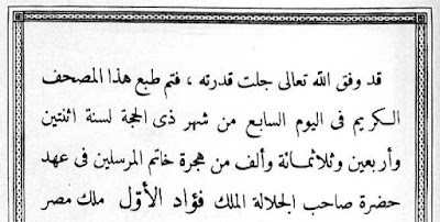
Printing was finished 7. Ḏul Ḥigga 1342 (= 10.7. 1924).
I have a problem:
How can the book with that text inside know when its printing was finished?
Was it observing its own printing and taking the time?
I guess (!) that the date given was just the date planned,
and because they could not meet it, they de­cided to stamp the finished book with the real date:
The differences between the editions before 1952 are minor.
My main conclusion from studying the text of 1242/43:
it is not the result of year long committee discussions,
nor the appli­cation of what ad-Dānī and Ibn Naǧǧāḥ have written about the rasm,
but a switch form Indian-Persian-Ottoman practise of writing the well established text of Ḥafṣ
to applying the African (Maġribian, Andalusian) rules (with­out clolour dots, too ex­pensice/com­plicated for printing at the time).
The text the type setters set &npsp; was written by the chief reader of Egypt, Muḥam­mad ibn ʿAlī ibn Ḫalaf al-Ḥusai­nī al-Mālikī aṣ-Ṣaʿīdī al-Ḥad­dād (born 1282/1865) who knew the dif­ferences between Warš (of which he had a copy at hand) and Ḥafṣ by heart.
After he had died on 22.1.1939, ʿAlī b. Muḥammad b. Ḥasan b. Ibrāhīm al-Maṣrī aḍ-Ḍabbāʿ be­came chief reciter of the qurʾān. He chaired a commi­ttee to revise the written text. Apart of one clear mistake (the spelling of /kalimat/ in 7:137), some minor corrections, the elimina­tion of infor­mation on the chrono­logy in the sura title boxes, the inclusion of the basmalla in continu­ous reading (which leads to tann becoming tamm at the end of suras 4, 5, 6, 17, 18, 19, 24, 25, 31, 33, 34, 35, 38, 41, 48, 54, 65, 67, 71, 72, 73, 76, 78, 84, 85, 86, 90, 100, 101, 104, 105, 106, and 110)
and about 800 changes in pause signs were decreed ‒ decreed, not made, because the changes were only made in the large editions, for which new plates were manu­factured. For the small editions old plates were used, and here some changes were just not made, others by hand. Only the changes in tanwin were all made. (on the image in the middle from the 1954 small edition the sura title box is the old one and the mīm added by hand
below from the Tash­kent 1960 reprint.)
so we have: KFE_1   less than 1000 changges   in KFE_2 /2a
but: kfe1345, kfe1347 ; less than 100 changes   in kfe1371 based on kfe1347 except for the nūn in 73:20
And the changes introduced in kfe1345 and kfe1347 are all gone in KFE_2;
BECAUSE they never occured on the large plates ‒ existing plates were reused.

So, there are technical reasons for the content of the different editions.

While for the Muṣḥaf al-Azhar aš-Šarīf, "the Šamarlī" and the Madina Editions
we have different sizes of the same content,
while we have huge runs of Madina Editions, hence fresh plates (almost) evey year,
the runs of King Fuʾād Editions were low, so low that some of the 1924 plates were used until the end, and some of the first small plates from the next year to the end.

­‒

Saturday, 9 November 2024

KFEs (continued)

Although it is often written that the King Fuʾād Edition fixed a some­how unclear text, and established the reading of Ḥafṣ accord­ing to ʿĀsim as pre­dominant, both assertions are rubbish.
How could Islam exist with a chaotic base text? And for about 400 years Ḥafṣ was by far the most im­portant reading. The three gun-powder empires ‒ Safavid, Timurid/Moghul and Ottoman ‒ had made it their imperial read­ing, because it is the easiest for non-Arabs <= the closes to fuṣḥā.
A second reason could be that Timurids and Ottoman adopted the Kūfī maḏhab al-Ḥanafiyya. And like Moroccans follow the Madinese maḍhab al-Mālik­iyya and read accord­ing to the Madinese Warš, so most Ḥanifīs read accord­ing to Ḥafṣ.

All KFEs have an empty, un­paginat­ed, but counted title page, 826 pages of qurʾanic text
‒ al-fātiḥa being on page 2, an-nās on page 827 ‒ plus 23 pages, 22 being paginated (the last being ت)
In the KFE II of 1952 the first 845 pages are roughly identical to KFE I,
the only difference being almost thousand changes in the qurʾānic text and that pages ج and ف are paginat­ed ‒ they used to be counted, but no letter was printed.
No KFE has a prayer/duʿāʾ.
In the last royal edition, KFE II 0, the next page is the im­pressum of 1924
followed by seven pages
In the large KFE II a editions (starting in 1953), three pages are gone:
the dedication to King Fuʾād, its empty back­side, and the empty page after س .
The page after س ,the خاتيمة on page ف is moved to after ض ,
something that hurts anyone who under­stands abjad.
Before the four pages Table of Suras (without the sura #) an empty page is inserted.
I call "King Fuʾād Edition" all Egyptian Government editions with the last sura on page 827.
Egyptian Government Editions on 522 pages (by the Minstry of Interior) or 525 pages (by the Amīriyya Press) are not KFEs.
Editions by Egyptian commercial publishers (with a title page) are not KFEs.
(Those with the set text of a KFE rearranged with more than 12 line per page (whether original lines or longer one) are definetly not KFEs.)
"Reprints" by publishers in Bairut, Damascus, ʿĀmmān are not KFEs
and can not be trusted: the مصلحة المساحة is not in القاهرة but in Giza.
"Reprints" by foreign countries like China (of KFE I ‒ with­out the dedi­cation to the King) ‒
and the Kazach (1960)
and Qaṭar (1985) one of KFE II ,
are not KFEs, but some­times more reliable when it comes to the qur'anic text ‒ just 73:20 is a problem..
Nor is the the Frommann-Holzboog/ITS (Stuttgart 1983) edition a KFE although it has 826 pages of qur'anic text and no title page. Its afterword is set in Stuttgart ‒ the type is not appealing.

The small kfe II b have nine pages less then the large one of 1952:
the dedication page and its backside, plus the seven pages on changes to the editions before 1952.
There is a downloadable pdf of the small 1954 print. There one can see, why the seven pages on the almost thousand changes are missing.
While للطاغين in 78:22 is changed to للطٰغين , in 38:55 it is changed in the large editions, but not in the small ones.

The change in 7:137 is


properly (type set) done
in the large editions (KFE II 0/a),


while it is done by hand in the small editions after 1952 (kfe II b).
By hand are the mīms in the small editions.
on the left the 1924 KFE I, in the middle the large KFE IIa 1952, on the right the small kfe II b after 1952 edition.

While the title box have less information in the 1952 edition, they are the old ones in the small edition.
on top the KFE I, in the middle the Qatari "reprint" of the large 1952 edition, because there is no pdf of either KFE II 0 nor KFE II a   online,
below a title box of a small one (kfe II b).

And page 826 of KFE I, KFE II a, and kfe II b (the small plates are not refreshed):
Of the almost thousand changes descriped on the "Seven Pages" only a handful are im­plemented in the small editions, e.g. the hamza in qāʾim is not moved down:

The chaos in the Amiriyya editions forces the observer to have a close look at private adaptations.
While the base for Marwān Sawār (Damas­cus 1983 - 13 lines per page) is a large one with all changes made by aḍ-Ḍabbāʿ (above 13:33 and below)
Ibrāhīm Muʿallim (al-Qāhira Dār Šurūq 1975) some­times has the old ortho­graphy or it is changed by hand,


Sometimes, when done by private hand, it is not worse: on the left from the large KFE II a, on the right Dar Šurūq:
cf. in German

Merkaz Ṭab-o Našr

from a German blog coPilot made this Englsih one Iranian Qur'an Orthography: Editorial Principles and Variants The Iranian مرکز...