as there is not THE Muṣṭafā Naẓīf Qadirġalī muṣḥaf, but two written by him (plus one re-arranged and maybe ten with (partialy) andalusized spelling
as there is not THE Šamarlī but four very different ones,
BTW: when the KFC calls their editions (of Ḥafṣ and of Dūrī) on 522 pages "Šamarlī" it shows that they are igorant: almost 100 years before the Egyptian publisher produced a muṣḥaf with the famous 15-line-on522-pages layout, Muṣṭafā Naẓīf Qadirġaī had written one in Istanbul, and Šamarli had others formatsas there is not THE Madina al-Nabawiyya Edition, but ten,
AND there is not ONE Muḥammad Saʿd Ibrāhīm al-Ḥaddād edition
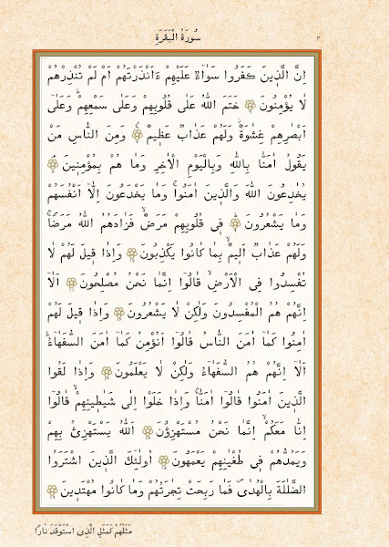
as there is not THE Madina ʿUṯmān Ṭaha edition of Ḥafṣ but almost fifty
three if one looks at substantial differences (not at colour, size, decoration etc.),
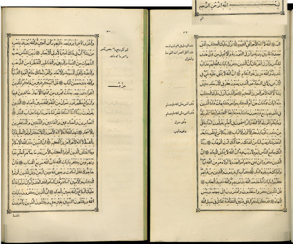
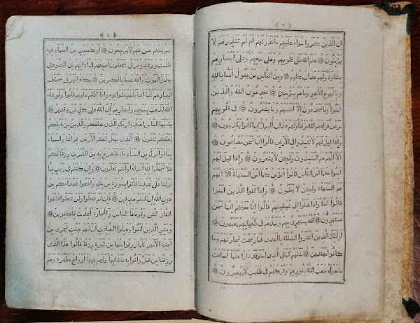
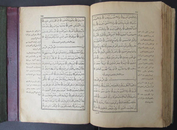
there are many different Kazan editions: first the St.Petersburg with 13 lines: hundred years later in Kazan, with 13 lines too, but very different: The first Kazan edition, 1803, had only nine lines:
one of 1286/1852 with 17 lines, pagination top at the edges: one of 1307/1890 with 13 lines: Not only the layout changes, but the font as well: 1857 there were more stapeled forms than 1907 which shows that the KFE with its reduced set of forms (its base line emphasis, and clear connection between letter and vowel sign) was not extra-ordinary, but a child of the Zeitgeist. While first the type cutters wanted to come as close as possible to hand writing, they wanted to make the text as clear and readable as possible (once type set maṣāḥif were accepted). And there a new ones: ‒
