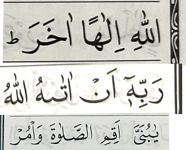
In manuscripts and lithographs the turned fatha [ā] sometimes sits instead
on or after lām (لـ) or hamza (ا)
before lām or hamza.
If it is due to lack of place and occurs seldom, it is not a problem.
But in some modern computer set prints
long fathas are
always after lām and
always before hamza.
Why?
I assumed that the IT experts first type the long fatha, then the hamza(alif),
but because the /ā/ always comes first and then the /ʾ/
I now guess that in the data stream there is no mistake,
but the font is the culprit:
that the font places long fatha that is logically after hamza
graphically before the hamza, because it looks nicer.
Can anyhow tell them that the text is there to be read, not to look nice.
For those who do not understand,
here is the SAME electronic text, rendered by two different fonts:
What is true for /ʾā/ is true for /ʾī/ as well.

 Two additinal remarks on the early prints: lengthening of pronouns (-hī, -hū) is left unnoticed (typical for Ottoman)