The Taj Company Ltd.
produced editions with nine, ten, eleven, twelve, 13, 16, 17 and 18 lines. Those on 611 pages (15 lines) and 848 pages (13 lines) are reprinted in India, Saudi-Arabia, China, South Africa, Bangla Desh ...

I admit: I do not have
a Taj print with 13 lines but since Adrian Alan Brockett had copies of it and
affirms that the 1398/1978 South African edition is based on it (STUDIES IN
TWO TRANSMISSIONS OF THE QUR'AN 1984, p22, 26, passim) I assume that he is right.
Waterval Islamic Institute (Johannisburg) made a second print in 1400/1980, a third in 1405/1985,
a fourth in 1409/1989, a fifth in 1413/1993,
a sixth in 1417/1996, a seventh in 1420/1999,
a eighth in 1423/2003, a ninth in 1428/2007,
a tenth in 1432/2011, an eleventh 1435/2014,
a twelfth in 1437/2015, plus two more before they had one set in a font with the ʿUthman Ṭaha handwriting.
There is an edition circulating in South Africa that is
line identical to this Taj edition: written by (ʿAbdul-)Ḫalīq (al-)Asadī without
Yāʾ Barī and the cut off tails of خ ح ج ع غ typical for the Lahorī style.
Unlike the Taj/Waterval Islamic Institute edition it has catchwords.
Nurul-Huda (South Africa) even
uploaded a pdf of that
mushaf
to which it added the title page of Waterval Islamic Institute.
Since 2022 there is a Waterval Islamic Institute edition that is page identical but
‒ fortunately ‒ not line identical: whenever a line ended with "و/and" that letter
was moved to the next line where it belongs according to the rules of Arabic ‒ once even to the next page.
This new edition is not an offset reproduction of a handwritten
muṣḥaf,
but set on a computer ‒ and printed in India
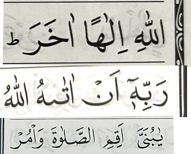
on the left: Taj/WII. in the middle the new WII, on the right part of Ḫalīq Asadī
Nurul-Huda has made a font set
muṣḥaf on 848 pages (the South African "norm") but
it is not line identical: when ever possible verses end in the last left corner of the page. So, one of the SA publisher has made a print with a font that looks like ʿUṯmān Ṭaha (with moved waws) and
an other pdfs in an "Pakistani-like" font with slightly different pages.
Unfortunaley Nurul-Huda places the long fatḥa after the upright hamza, not after it, as it does for lām: (/lā/ but /āʾ/).
Whereas South African do not understand that initial "alif" is a
hamza, and
that its vowel sign must sit
above, below or
after (never
before),
Indonesians (and the King Fahd Complex) know it.
In the columns on the right (Pak Company/Dar us-Salam and King Fahd Complex) and the two on the left (from
Indonesia) the vowel sign for /ā/, the up-right fatḥa, is always behind the
hamza, the big alif. But in South Africa (the columns in the middle) often
/āʾ/ is written for /ʾā/.
Here an other example of wrongly placed standing/turnded/long fatha
ʾauliyā'uhumu
not ʾauliāy'uhumu
different, but without fault in the
16 liner by Daras-Salam, Uṯmān Ṭaja (Giza1924) and Indonesian:
While outside of Pakistan ‒ e.g. India and South Africa ‒ publisher just steal the Taj Ltd.
muṣḥaf, in Pakistan itself other publishers (like Pak Company, Qudratullah, Gaba)
have calligraphers make line identical copies, so there are at least ten 13liners on paper and on the web, in black and white and with colours for tajwīd.
There is a luxury 848pp. edition by Tāj Kampanī Ltd. Lahore
I downloaded it from here
now the comparison between this edition without the frame with the original that was reprinted in South Africa: