Showing posts with label al-Ḥabbābī. Show all posts

Sunday, 16 March 2025

The Moroccan Qurʾān / Le Coran maroccain (Anouk Cohen)

For the last fifteen years, Anouk Cohen writes the same article again and again.
There is nothing wrong, with having found one's field.
Everything is wrong when one finds the same mistakes from the first article to the last.
In my view, the last one (Seeing and Hearing the Book: A Moroccan Edition of the Qurʾan) is just a string of errors, not worth listing them.
In it she compares "the Saudi edition" with "the Moroccan Qur'an" aka "the muṣḥaf muḥam­madī" although there are more than a hundred Saudi editions, more than hundred Moroccan Qur'an editions and three very dif­ferent "Muṣḥaf Muḥam­madī" (about ten with minor dif­ferences).
The "differences between THE Saudi and THE Morroccan" do not exist:
Moroccan editions are the trans­mission of Warš following Nafīʿ, with saǧadā signs accord­ing to the Malikī maḏhab, Madinī verse counting, Maġribī hand­writ­ing/font.
What Cohen shows as THE Saudi edition is the trans­mission of Ḥafṣ following ʿĀṣim, with saġadā signs according to the Hambalī maḏhab, Kūfī counting, nasḫī handwriting/font by ʿUṯmān Ṭaha, printed by KFC.
But there are Moroccan reprints of Saudi editions ...
... and the Suʿudī "King Fahd Glorious Quran Printing Complex" (KFC) publishes the Warš transmission in Maġribī hand­writing.
Suʿudī is not always the same. The KFC publishes editions for North-West Africa and for India (but not for Turkey, Iran, nor Indo­nesia).
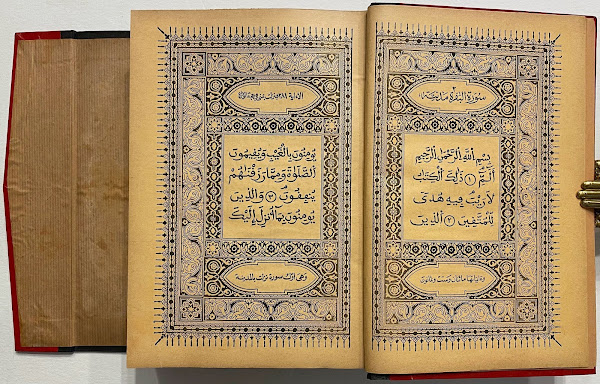
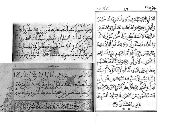
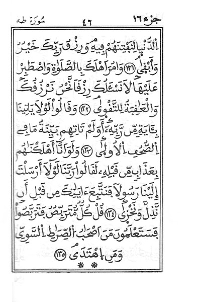
Here images that show that there is no clear cit between muṣḥaf muḥam­madī"-Malikī and the rest-non-Maliki
According to Cohen this is THE muṣḥaf muḥam­madī fatiḥa:
But this is a muṣḥaf muḥammadī fatiḥa as well:
According to Cohen this is THE Saudi one
But these are two more (out of many) from Madina
To put it bluntly. What Cohen writes is based on 90% ignorance resp. blindness.
p.142: "According to the protocol defined in the 1920s in Cairo by al-Azhar each stage of pro­uction should be sub­ject to control."
    ‒ no source given, de­finetly wrong
p.144: "the Egyptian copy [of the Qurʾān] developed at al-Azhar in 1924
    ‒ just wrong
p.144: "Contrary to the muṣḥaf ḥassanī, which was to be offered to dis­tin­guished guests, the muṣ­ḥaf muḥam­madī was placed under serial and industri­al pro­duction."
    ‒ wrong, both maṣā­ḥif have expen­si­ve (big, colour, glossy paper) versions and cheaper ones, and none is gift only: one could buy them.

Before I move on to the Warš muṣḥaf of 1929: A.Cohen writes three pp. 145-148 on the calli­graphy of the "Mo­roc­can muṣ­ḥaf" incl. strange things like "'The line should not be so long, even if it does not change the meaning. There should be no ex­cessive read­ing.'” quoting a "cleric".
‒ first, the cleric says: "There should be no ex­ten­ded line because that could lead to pro­longa­tion in recit­ing."
‒ second, "of course" there are extended lines in Maġ­ri­bī maṣāḥif to justify lines. The first word /ḏālika/ is from Cohen's text, showing what is forbidden. All others are from Muṣḥaf al-Ḥasanī.

Three pages, but she does not mention THE most important fact:

Muṣḥaf Muḥammadī is not handwritten by PC set!


Let's move to what she calls "the 'Qurʾan of Zwiten,'26 26 ... Until recent­ly, the rights to it be­longed to Dar al-muṣḥaf al-sharīf, in Cairo. See Abdul­razak Fawzi, The King­dom of the Book: The History of Printing as an Agency of Change in Morocco bet­ween 1865 and 1912 (PhD diss., Uni­ver­sity of Boston, 1990)."
Of course A. Fawzi says no­thing of the kind. Why else do we not get a page number, where he would say so? A.Cohen is making it up as in most of her publi­cations: Hot air or lies!
Of course we do not get any infor­ma­tion about this print of re­ference, not even a picture of the cover, nor of any of the pages! ‒ just as in her ear­lier articles she wrote that it was very often re­printed without giving years, nor pub­lishers!
As often, Bergsträßer tells us a lot
He quotes the "Maghribian book sellers" (two members of the al-Ḥabbābī familiy) that Egyptian printers and Šaiḫs could improve the edition, written by Aḥmad bn Ḥasan Zwīten, checked by Moroccan šaiḫs, and again in Egypt, where it was printed ‒ dedicated to Sulṭan Muḥmmad [V.] bn Yūsuf
This Cairo Warš Edition, Cairo 1929 Edition, al-Ḥabbābī edition, Zwīten edition is the first Moroccan edition with numbers after each verse, and ‒ a revolution of sorts ‒ Kufī numbers;
so ʿAlī Muḥammad aḍ-Ḍabbāʿ (1304/1886-1380/1960) writes four pages on the differences between (second) Madani and Kufi mumbering (pages 8-11):
the cover of the first edition
the first three pages:
instead of a title page:
(this is from the copy of the Academy of Sciences in Lissa­bon that is not paginated in quarters, but in halves; its index and the duʿāʾ are set in normal Arabic letters, while hand­written in the original.)
the ʿanwān of the first edition
So are no pagination.
As often, THE Zwīten does not exist, the original one is divided into four parts, and has before the quranic text faḍl al-qurʾān and ādāb at-tilāwa; all is hand­written, the last four pages in eastern nasḫ pointed like in the east (no dots on final nūn, fā' and qāf, fā'-dot below, single qāf-dot above), all other parts in maġribi masbūṭ, while the Lissa­bon copy (in halves) lacks most additions.
Maybe these two strange pages are due to merging quarters into halves (??) Or to have the ḥizb start on a new page?
Normal pages have 15 lines
last page of first half
With a book seller I found a last quarter printed in 1990.


She does not know that most Western readers need the number of suras.
"al-Naml (the Ants)" should be "XXVII" or "an-Naml (27)".
ḫaṭṭ is handwriting, script, not calligraphy which is fann al-ḫaṭṭ.
taḏhīb is gilding, not illuminations.
taškīl is vocalization, not "vocalization signs"; vowel signs are harakāt.
the commander of the believers, not commanders of believers:
Why does she call his function "myth"?
She translates her French "encore" (in Voir et entendre le Livre. Une édition maro­caine du Coran. 2017) (which means here « en outre »/"fur­ther­more, more­over") as "still"/ « tou­jours » « quand même » .

The article feels like written by a large language model artifi­cial intel­ligence.
Some sentences sound reasonable, others like halu­cina­tions

Sometimes the connection is missing: first [he writes] "on paper plates",
which are then "calligraphic tablets".
lawḥ, a wooden tablet, is defined as "a Qurʾanic tablet that com­bines writ­ing and recita­tion"
‒ it has no loud speakers.
First she writes ‒ correctly ‒ of "the seven canonical readings (qirāʾa)",
then ‒ in­correct­ly ‒ of "the seven Moroccan reci­tations";
the seven qirāʾāt (proper plural form) neither being Moroccan, nor reci­tations.
similarly: "the dominant recitation in Morocco (Warsh)" ‒ the ways of recitation (taḥzzabt, muǧawwd, murattal) have nothing special to do with Warš ‒ no more than "high way" with Chrys­ler and Tesla.
her note 2: muṣḥaf = volume, Qurʾān = revelation, while the first is "codex", the second "reading, reci­tation"
In note 20 she cites Gérard Trou­peau with: "To indicate the three short vowels, [Arabic] borrowed three Syriac signs" although Trou­peau has not written this, and it is cer­tainly wrong.


‒ ­

Sunday, 12 January 2025

A.A.Brockett --- Warš

40 years ago Adrian Alan Brockett submitted his Ph.D. to the Uni­versi­ty of St.Andrews: Studies in Two Trans­missions of the Qurʾān. Now he was a doctor of philosophy but he did not get tenure at a university ‒ for a living he became an argicul­tural advisor in the UAE.
My main thesis ‒ on earth there is not THE Standard printed Qurʾān ‒ was already proven by him:
the "official" text of 1342/1924 is not official.
He showed:
the qurʾān was transmitted through the ages both orally and in writing.
the two tansmissions support each other, controll each other.
and: Differences between transmissions are minor.
The sound form (maṣā­ḥif murat­tal) and the graphic form of writ­ten/printed maṣāḥif differ, but there is only ONE qurʾān.

He wrote this before the age of the internet, of Unicode, before ʿUṭmān Ṭāha, and editions of Qālūn from Damas­cus, Dubai, Tripoli und Tunis, before one could listen to fourteen riwayāt on CD and TV.
He collected many editions of Ḥafṣ and Warš from Egypt, Iran and Tunisia, and consulted a few manuscripts (in Edinburgh)
At the time, there were no critical editions neither of Zamaḫšarī's Kaššāf nor Sība­waihī's Kitāb. So when a word was given with a different spelling he had to find out, whether it was a typo or a "real" difference.
Neither with typewriters nor on the computer it was easy to write text that had both Latin and Arabic script. Therefore he used a "trans­liter­a­t­ion" of his own making (not as good as the one deviced by Rüdiger Puin later.
Unfortunately he did not known what a trans­lite­ration is, confused it with tran­scrip­tion.
trans­liter­at­ion renders the letters of the original unambiguous­ly/ob­jec­tivly, best one-to-one and onto
hence it is revers­able (without deep knowledge of the langu­ages)
does not need to be speakable.
tran­scrip­tion renders the sounds of the original in the second language; should be pronounc­able after a short instruction:
is not reversable without knowing the languages well,
which is not the case for Brockett's "trans­literation".
I can't read it, I have to rely on chapter and verse.
The tilde sometimes stands for "not in the rasm" sometimes for "extra-long".
Some of his terms are just stupid.
At least he defines them before using them.
"graphic" signifies "written in the rasm,"
"vocal" for "not in the rasm"
"The term 'vocal form', with respect to the Qur'ān, is used through­out to signify the letter skeleton fully fleshed out with dia­criti­cal marks, vowels, and so on."
is nonsense:
1. his "vocal" is not the sceleton fully fleshed out"
  but; "only the flesh (= diacritics) without the sceleton"
2. in the Qurʾān there are non consonats, but just letters
3. the letter sceleton is not mute (avocal) and dots, strokes and signs are not all and only about sound,
both are written AND spoken, are both graphic and phonetic.
What he wants to say is: some signs are there from the beginnings ,
others were added later: diacri­tical dots (although some dots were there in the earliest mss.), vowel signs (harakat), tašdīd, hamza sign, waṣla sign, signs for , signs for Imala, Išmām, assimi­lation, non-pronounciation (either always or when no pause is made) of written letters, consonats having no voyel (unmoved as they say in Arabic), Nachdruck, Ab­schwä&­chung, Über­dehnung.
Es gibt also auch Zeichen, die geschrie­ben wurden, aber nicht gesprochen; außerdem Aus­sprache­phäno­mene, die nur in guten Aus­gaben ge­schrieben werden (wie Nasa­lierung, Assimi­lation, Deut­lich­keit, Nach­druck) <beim Letzt­genann­ten ist zu unter­scheiden: Buch­staben, die immer nach­drücklich sind, welche, die in der Umgebung nach­drück­lich sind und solchen, die aus­nahms­weise nach­drücklich sind ‒ nur das Dritte muss notiert werden>
3.) Obwohl er "definiert": The term 'graphic form' refers to the bare consonantal skeleton, meint er auch dies nicht; er meint rasm+diakrit.Punkte ‒ und "vocal" für den Rest.

Da seine Arbeit immer noch das Beste ist, was auf Englisch dazu vorliegt
und ich sie auch aus­schlach­ten will,
erst die Kritik ‒ das haben wir dann hinter uns.
Die eklatanten Fehler liegen daran, dass es eine Doktor­arbeit ist, keine Pub­likation.
Der Autor war jung und uner­fahren und er durfte sie niemandem zur Korrektur, Aus­bessern, Aus­diskutieren vorlegen. Es sollte ja keine fertige Arbeit sein, sondern nur ein Nach­weis dafür, dass er wissen­schaft­lich arbeiten könnte,
und das zeigte er nicht nur bei der Manu­skript­datierung anhand der Wasser­zeichen und den kriti­schen Fuß­noten zur ver­wende­ten Literatur, sondern auch mit dem Aufstellen und Belegen von Thesen.

Kurios ist, dass er den 1924er Druck für die Wieder­gabe einer Hand­schrift hielt.
dass er den 1982er qatari­schen Reprint für den Reprint dieses Druckes hielt,
obwohl es sich um einen Reprint des (an über 900 Stellen abweichenden) 1952er Druckes handelt,
dass er ein Kolophon zitiert, in dem Ḥasan Riḍā als Schreiber genannt wird, er aber "Āyat Barkenār" für den ‒ ihm unbe­kannten ‒ Kalli­graphen hält.
Dass er glaubt, dass man 1978 aus Pakistan Druck­platten nach Johannes­burg trans­portierte, um einen Tāj-Ausgabe nachzu­drucken, zeigt, dass er von Drucktechnik null Ahnung hatte, weshalb ich die vielen Anmerkungen zu diesem Aspekt völlig ignoriere (wenn ich die von ihm kon­sultierten Ausgaben zur Hand hätte oder von ihm erfahren könnte, worauf er seine Bemerkungen stüzt, wäre es anders.)
Zum Glück habe ich fast alle von ihm erwähnte Ausgaben ‒ sei es gebunden, sei es als pdf. Für die Aus­gaben aus Delhi, Bombay und Calcutta habe ich immer­hin äqui­valente. Ich kann deshalb die meisten seiner Angaben nachvoll­ziehen. Und für Anderes habe ich zusätzliche Belege.
Nirgends komme ich zu anderen Schluss­folgerungen.


‒ ­ Ging es bisher hauptsächlich um Ḥafṣ-Ausgaben, wollen wir jetzt noch einen Blick auf andere Les­arten werfen, dabei geht es vor allem um Äußer­lich­keiten. Beginnen wir mit den „unerheb­lichen Buch­sta­ben“ (al-ḥurūf al-yasīra): den ganz wenigen Unter­schie­den, die nicht durch šadda, fatḥa, kasra, ḍamma, hamza, madda oder diakritische Punkte ausgedrückt werden, sondern im rasm.
Ibrāhīm hat bei Ḥafṣ weder alif noch yāʾ, bei Nāfīʿ jedoch yāʾ – ich sage nicht Warš, weil es in den drei Zeilen nicht den geringsten Unterschied zwischen beiden riwāyāt gibt – für dies hier ein Bei­spiel: Während Qālūn mit hamza zu sprechen ist, ist es bei Warš ge­schwächt. (Schrei­bungen von Uṭmān Ṭaha für den KFK.)
Während der Vers bei Ḥafṣ mit wa- beginnt, fehlt dies bei Qālūn.
Beide Male hat Ḥafṣ ein alif mehr: erst in der Mitte der Zeile, auf der nächsten Seite in Zeile Zwo (ʾauʾan vs. waʾan). Man beachte das winklige ḍamma, in Uni­code ein an­de­res Zei­chen.
Im Netz findet man Viel zu Unter­schieden zwischen Ḥafṣ und Warš. Viele wollen damit be­wei­sen, dass die musli­mische Über­lieferung unzu­ver­lässig ist. Oder sie wollen heraus­bekom­men, wel­ches der rich­ti­ge qurʾān ist. Oder sie be­haupten, die Unter­schiede seien nur phone­tisch. Wirklich gut bei der Dar­stel­lung der Unter­schiede und bei deren Bewertung ist Adrian A. Brockett. Hier einige seiner Unter­schiede.
Ḥafṣ                 Warš           Stelle
-kum, -hum, -him,     -kumu, -humu, -himu,
-tum, -tumu bzw. -kumū    xxx …
Ḥafṣ                 Warš             Stelle
yaḥsabuhumu yaḥsibuhuma 2:273
taḥsabanna taḥsibanna 3:169
أَتُحَـٰٓجُّوٓنِّي أَتُحَـٰٓجُّونِي 6:80
سَوَآءٌ عَلَيۡهِمۡ ءَأَنذَرۡتَهُمۡ سَوَآءٌ عَلَيۡهِمُۥ ءَآنذَرۡتَهُم 2:6
أَتُمِدُّونَنِ أَتُمِدُّونَنِۦ 27:36
قُلۡ ءَأَنتُمۡ أَعۡلَمُ ڧُل̱ۡ آنتُمۡۥۤ أَعۡلَمُ 2:140
وَإِنِّيٓ أُعِيذُهَا وَإِنِّيَ أُعِيذُهَا 3:36
هَـٰٓأَنتُمۡ هَآنتُمُۥۤ 3:119
إِنِّيٓ أَعۡلَمُ إِنِّيَ أَعۡلَمُ 2:30
هَـٰٓؤُلَآءِ إِن هَـٰٓؤُلَآءِ ؈ں 2:31
5:3 faman iḍṭurra faman uḍṭurra
أَوۡ إِثۡمًۭا أَواِثۡمًۭا 2:182
أَوِ ٱخۡرُجُواْ أَوِ ﰩخۡرُجُواْ 4:66
قَرِيبٌ‌ أُجِيبُ ڧَرِيبٌ‌ اجِيبُ 2:186
6:10 ..qad istuhziʾa ..qad ustuhziʾa
بِئۡسَمَا يَأۡمُرُكُم بِيسَمَا يَامُرُكُم 2:93
نَبِيًّۭا نَبِيـًۭٔا 3:39
وَٱلصَّـٰبِـِٔينَ وَالصَّـٰبِـيںَ 2:62
ٱلنَّبِيَّ ؇لنَّبِيٓءَ 7:157
تُسۡـَٔلُ تَسۡـَٔلۡ 2:119
أَؤُنَبِّئُكُم اَو۟ ۬ نَبِّئُكُم 3:15
تُسَوَّىٰ تَسَّوّٜىٰ 4:42
Warš-Drucke erscheinen 1879 und 1891 als großformatige, dreifarbige Steindrucke in Fez; in den 1890ger gibt es jährlich kleinere Drucke in schwarz-weiß. Um 1900 erscheint der erste in Algerien.
The first muṣḥaf printed in Morocco was printed in 1296/1879 in Faz. It has 19 lines on a page, and uses black, red and blue

keine Änderungen

The next one has 25 lines per page:
one from 1313/1895/6 1331/1911/2 ar-Rūdūsī bn Murād at-Turkī from the island of Rhodes living in Algiers prints a muṣḥaf with 14 lines in his maṭbCat aṯ-ṯaCAlibiyya
The edition of 1350/1931 can be downloaded in the net at several sides.
Instead of the counting "Madina 2" "Kufa" is used
((these days, other publisher both in Damascus and in Algiers use the Kufī numbering -- on the right the Tijani print:
Qurʾān Ma¬ǧīd, Alger: Ma¬ṭbaʿa aṯ-Ṯa­ʿā­li­bīya 1356/1937 mit farbigem ʿanwān
another one from the web site of the Foundation du Roi Abelaziz in Casablanca:
first pages and last of a muṣḥaf in two volumes, 19 lines per page

In der Zeit zwischen den Weltkriegen stiegen ägyptische Verlage in das Geschäft ein, hier Beispiele aus einer Werbebroschüre von Muṣṭafā al-Bābī al-Ḥalabī.

1929 in Egypt, where it was printed ‒ dedicated to Sulṭan Muḥmmad [V.] bn Yūsuf
This Cairo Warš Edition, Cairo 1929 Edition, al-Ḥabbābī edition, Zwīten edition is the first Moroccan edition with numbers after each verse, and ‒ a revolution of sorts ‒ Kufī numbers;
so ʿAlī Muḥammad aḍ-Ḍabbāʿ (1304/1886-1380/1960) writes four pages on the differences between (second) Madani and Kufi mumbering (pages 8-11):
the cover of the first edition
the first three pages:
instead of a title page:
(this is from the copy of the Academy of Sciences in Lissa­bon that is not paginated in quarters, but in halves; its index and the duʿāʾ are set in normal Arabic letters, while hand­written in the original.)
the ʿanwān of the first edition
So are no pagination.
As often, THE Zwīten does not exist, the original one is divided into four parts, and has before the quranic text faḍl al-qurʾān and ādāb at-tilāwa; all is hand­written, the last four pages in eastern nasḫ pointed like in the east (no dots on final nūn, fā' and qāf, fā'-dot below, single qāf-dot above), all other parts in maġribi masbūṭ, while the Lissa­bon copy (in halves) lacks most additions.
Maybe these two strange pages are due to merging quarters into halves (??) Or to have the ḥizb start on a new page?
Normal pages have 15 lines
last page of first half
With a book seller I found a last quarter printed in 1990.
In Algeria Sufi fraternities had editions of their own:
Šaḏilī
Tijani
printed on salmon paper, printed at the expense of Tijani al-Muhammadi, owner of the al-Manar Press and Library, who was also responsible for calligraphy and decoration Tunisia 1365/1945/6
‒ ­

Nairīzī

Mirza Aḥmad an-Nairīzī (ca. 1650–1747) is the last of the classical Iranian calligraher s. Informations are hard to find, because often und...