The letters of the qurʾān do not exactely tell you how to pronounce the text.
Some vowels have to be lengthened, others naselized,
some consonants are emphatical or esp. clearly pronounced.
Quite a lot of written letters are not pronounced.
Some of these oral phenonema are reflected in the "normal" text.
According to Q52 a
waṣl-sign above an alif and a circle above any letter say:
Do not pronounce!
This is expressed in Indo-Pak by absence of any sign.
– Unfortunately today some Indians set the silent-circle, thus deluting their own clear system.
(Waterfaal Islamic Institute wants to make it better, using NO sign for the Q52 circle, putting a circle for the Q52 ovale, but sometimes they put the wrong sign ‒ alas.)
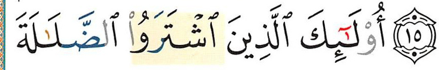
There are many different prints that use colour to distinguish how to pronounce:
The image above is from Dar al-Maʿrifa in Bairut, formally Damascus. In Verse 16 not all silent letters are grey (they think the
waṣl says it, so they leave the alif black, althought it is mute (by the same logic letters below a circle would have to be black):
In verse 8 DaM (Dar al-Maʾrifa), Nous-mêmes (Nm) from Tunis, and Hasenat from Turkey colour the nūn from /man/ before /yaqūl/ because it is assimilated (and Nm puts a
šadda above the yāʾ to which the nūn is assimilated).
On the other hand, DaM and Nm do not grey out the alif of [al-nās] marked as silent by Hasenat and Merkaz ṬaboNašr, which does not bother about assimilation.
(Nm does not even grey the lām assimilated to nūn!)
the two above are from Nous-mêmes/Hanibal and from Tehran.
Here four times [min/man] from Indonesia, Bairut/Damascus (Muʾassasat al-Īmān) and twice from Lahore, Pakistani Punjab (
Qudratullah and
Hammad) plus the 13liner from Taj coloured by
Madrasah.co.uk
in these examples all silent letters are coloured as silent:
The two pages above are from Turkey (Hasenat) and from Indonesia (
Mushaf
Indonesia
Standar Warna).
In the first line on the next image (Nm) do not mark the difference between /fī/ and /fĭ/ assuming that their (Arab) readers make it automatically right.
Muʾassasat al-Īmān (in Bairut), Indonesians and Iranians do make the difference.
(Note that the Indonesians do not use colour for silent letters trusting the Indian system: absence of any sign = mute.)
(Note that the Iranians in the last line do not mark the assimilation of mīm to mīm.)
above the pages from Lahore,
and the page written for the 13liner of Taj Com Ltd. coloured for Madrasah.co.uk.
And for good measure from yet another Lahore company:
Pak:
and from the Islamic Academy in Texas (text written by Mahmud Ahmad ʿAbdal-Ḥaqq)
one from Indonesia:
an
earlier post on the subject
‒
 BerKenār ʿUṯmān Ṭaha started in Damascus, but today is mostly associated with Madina.


 Two or three years later these extra pauses without pause sign were removed without any explanation.
 (click for better view – as in most blogger posts)
–
(click for better view – as in most blogger posts)
–