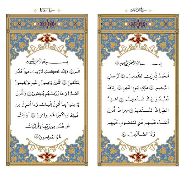
Sunday, 14 April 2024

a book by Saima Yacoob, Charlotte, North Carolina


At the start of this year's Ramaḍān Saima Yacoob, Char­lotte, North Caro­lina published a book on diffe­rences bet­ween printed maṣā­ḥif. Although her start­ing point and her con­clusions are worthy, the book is full of mis­takes.
Let's start with the positive:
• I believe that it would be a great loss to our um­mah if we were to insist on abandon­ing [the exist­ing] diver­sity [in] apply[ing] the rules of ḍabṭ ...
• The framework of the science of ḍabṭ is that dia­critics be used to ensure that the Qurʾān can be recited correctly by the average Muslim, and that there is enough regional standardi­zation ... that the people of an area may read the Qurʾān cor­rect­ly through the maṣāḥif published ... in that area.
• Because of the flexibility [in] the science of ḍabṭ, new conventions of ḍabṭ may be added even today to meet the chang­ing needs of Muslims in a parti­cular region. A modern example of this is the tajwīd color coded maṣā­ḥif.
This is an important point: maṣāḥif do not have to be identical to be valid. Only the last remark is wrong: color coded maṣāḥif are not "particular [to a] region".
I will give an example that springs from a particular region: The Irani Muṣḥaf with simple vowel signs:
While we used to have two basic ways of writing vowels (the Western/"Afri­can" with three vowel signs, sukūn, and three small leng­then­ing letters, the Eastern/"Asian" with three short vowel signs, three long vowel signs, and sukūn/ǧasm)); now there is a third (the new "Iranian" with six vowel signs in which the sign for /ū/ is not a turned ḍamma as in Indo-Pak and Indonesia, but looks like the Maġri­bian/Afro-Arab small waw, without sukūn, but with a second color for "silent, unpro­nounced"):

Only the vowel signs count, vowel letters are ignored when the con­sonant before has a vowel sign and they have none; when a con­sonant has no vowel sign it is read with­out vowel (sukūn is not needed). When a "vowel letter" has a vowel sign, it is a con­sonant. There is no head of ʿain on/below alif (when there is a vowel sign, hamza is spoken). There are no small vowel lettes ‒ instead of "turned ḍamma/ulta peš" a small waw is used: it look like the small letter used in the West/Maghrib/Arab Countries, but is a vowel sign.


The main point of Differing Diacritics is: there are different ways to mark the fine points, and that's okay. The maṣāḥif have the same text, but the notation is not exactely the same.

On page 2 of the book the diactrics are defined. Šaiḫa Saima Yacoob states that there are three kinds:
1.) "letters that are addi­tional or omitted in the rasm"
2.) "fatḥah, kasrah, ḍammah, shaddah, etc."
"Thirdly, those markings that aid the reader to apply the general rules of tajwīd correctly, such as the sign for madd, or a shaddah that indicates idghām, etc."

ALL wrong.
First come the dots that distinguish letter with the same shape:
د <‒>ذ   ص <‒> ض   ب <‒> ن ي   ط <‒> ظ
Second: fatḥa, kasra, ḍamma, šaddah, sukūn, plus in "Asia" turned fatḥa, turned kasra, turned ḍamma
Third: tanwīn signs and signs for madd ‒ in Asia there are three kinds of madd signs, in "Africa" three kinds of tanwīn signs for each of the short vowels
‒ small vowel "letters that are addi­tional or omitted in the rasm" exist only in the African/Andalu­sian/Arab system
the tiny groups of small consonant letters (sīn, mīm, nūn) that modify pro­nounciation,
and the signs for išmām and imāla come fourth and fifth.
(In Turkey "qaṣr" and "madd" are a sixth group.)

On page 4 the šaiḫa writes: "the reader could easily get con­fused by the two sets of dots, those for vowels, and those that distin­guished similarly shaped letters from each other"
I disagree: the dots for vowels are in gold/yellow, green, red or blue (and usually big), those distin­guishing letters with the same base form are in black (like the letters, because they are part of the letters). How can one con­fuse (big) coloured and (smaller) black dots?
BTW, "distinguished similarly shaped letters from each other" ‒ what I called the first func­tion of diacritics ‒ is missing from her definition of ḍabṭ on page 2.

Yacoob sometimes repeats what is written in well known books, but makes no sense:
"symbols [for vowels] were taken from shortened versions of their original form, such as ... a portion of yāʾ for kasrah" (p.4).
While fatḥa and ḍamma look like small alif resp. waw, kasra is neither a shortened yāʾ nor a part of yāʾ ‒ to me it looks like a transposed fatḥa.
Unfortunately, I found very little information about the ḍabṭ of the South Asian muṣḥaf in Arabic. (p. 7)
okay, she did not find anything, but it is available and it is all in Arabic (although written by a Muslim from Tamil Nadu).
the Chinese muṣḥaf. (p. 7)
As far as I know, there is no printed Chinese muṣḥaf, definetly not "the Chinese muṣḥaf". I have two maṣāḥif from China: a Bejing reprint of the King Fuad Edition of 1924/5 and a Kash­gar reprint of the Taj edition with the text on 611 pages like the South Asian one printed by the King Fahd Complex.
That a reprint of a Taj edition follows the IndoPak rules goes with­out saying, but that is not "the Ch. m."!


Enough, it goes on like this: mistake after mistake. I don't under­stand how a care­ful person can write a book like this ‒ and not revise it in due course.


­

orthography (one for two)

And there is the opposite: one tooth (one letter) where two are needed.
I guess this a remnant of the early Hiǧazi pro­noun­ciation being notated in the earliest manu­scripts with few hamzat except at the beginn­ing of a word.
I show just two examples:
Mīkāl <--> Mikāʾīl because here the two tradents of ʿĀṣim diverge:


While the normal way is a "normal" yāʾ and an hover­ing hamza above (or with kasra: below) the connection.
In 26:176 in India the one yāʾ is ambi­guous:
the hamza above is a bit before,
the yāʾ-dots are a bit after the tooth.

in the top lines what is possible on computers (Unicode: hover­ing hamza)


in the middle Indian handwritten ambiguous solutions.


in the bottom line: Warš with one yāʾ

Wednesday, 10 April 2024

orthography (two for one)

In this blog I treat the quranic ortho­graphy ‒ not the extremely few dif­fer­ent letters and the few differen­ces in vowell­ing, doubling of letters due to the different qirāʾāt ‒ but only the different con­ventions of writing Ḥafṣ ʿan ʿĀṣim.
The main points you find here

In several posts I make clear that the Arabic script has just letters, not con­sonants and vowels. Many assume that the earliest "Hiǧāzī" manu­scripts had neither diacri­tical dots nor vowel marks ‒ both "invented" later. This is not the case. About 200 years later ‒ when the text was already well estab­lished ‒ Kufic manu­scripts (on land­scape parch­ments) were pro­duced with­out dots, but the earliest (portrait) parch­ments had dia­cri­tical strokes where necess­ary. But because vowel­ling was not yet establi­shed sometimes alif, yāʾ, and wāw were used for long or short (!) vowels.

Once vowelling (and "hamza-ing") were common, some of the added letters were super­fluous ‒ see on the left and below.
Orthographic differen­ces concern mostly alif, yāʾ, wāw and hamza (whether it is represented in the rasm by one of these vowel letters <because in the original Hiǧāzi pro­noun­cia­tion the "vanished hamza" had pro­longated the ori­ginaly short vowels> or by the inde­pen­dent letter head of ʿain.)

In the King Fuad Edition, the Šamarlī edition, in the edi­tions written by ʿUṯmān Ṭaha silent letters (that are not muted by pro­sody) are marked with a circel, when they are always silent, by an ovale, when pro­nounced when the reader stops after them ‒ for what­ever reason; silent when connected to the next word.

Here a reason why: because the pure rasm could be read in different ways. So before the "invention" of vowel signs/dots and the head of ʿAin for hamza, a vowel letter was added ‒ this by the way ‒ is a reason for adding a vowel letter for a short vowel. The personal pronoun انا (I) is an other example: you could say it has two alifs, but normally no /ā/, the first is hamza, the last helps not to confuse it with the particles ʾinna, ʾanna, ʾin ان


Here 4:83 with two words one after the other with the same rasm where it not for an "added" letter

In the next word yāʾ was "added" before kasra was common, to signal to the reader that the hamza is to be read as /ʾi/ ‒ /ʾī/ when the reader stops after it ‒ for whatever reason.


In the 1970 the Tāǧ Ltd Co added a page at the end of their editions
here as always you have to click on the image, then with the secondary mouse on it, choose "open in a new tab" and then "+"
Because the type writer is not the best:
المصاحف بجدة من زيادة الالف في كلمة "الانتم“ من الاية رقم ١٣ سورة الحشر
نحيطكم انه بالمقارنه بين طبعة هذا المصحف وطبعات المصاحف الاخرى ظهر أن زيادة الالف
تنفرد بها الطبعة المذكوره ومن الجائز ان تكون من قبيل الكلمات التي زيدت فيها الالف رسمًا لا نطقًا مثل
لااوضعو" [التوبة: 47] "او لاذبحنه" [النمل: 21] وغيرها من الكلمات التى سردها ابو عمر الداني في المقنع حيث قال

The pioneer on the matter was Brockett .... I have already posted on this matter. Allow me to added from the mentioned Muqnī


Interestingly the mufti (a decendent of ʿAbdal-Wahhāb) does not only mention an early authority (as orientalist scholars do), but adds a recent authority, the chief Reader/Recitor of Egypt al-Ḥusainī al-Ḥaddād al-Ḥusainī al-Ḥaddād who had made the King Fuad Edition of 1924/5

But not only alif can be otiose. So can yāʾ.
the monster fatḥa is no vowel sign, bur signals that there is a note on that word on the margin (see above)
now from Morocco, the model for the Gizeh print of 1024/5 ‒ if I am right
in prints/mss. from the Ottoman empire and Persia there is only one yāʾ
On 51:47 با يٮد al-Arkati writes:

The first MSI (Muṣḥaf Standar Indonesia 1983) had only one tooth بايۡدٍ
the second (MSI 2002) two: بايۡٮدٍ
I have to check what the third (MSI 2016) has.


Thursday, 7 September 2023

Bombay with a difference

In the middle of the 20th century Bombay publishers did not only print maṣāḥif for the subcontinent, for Indonesia, but for Central Asia as well (1375/1956):

Wednesday, 2 February 2022

early Malay world, Singapore II

In Cairo + Surabya I refer to Ali Akbars blog on the first printed muṣḥaf in Nusan­tara. Among his pictures are the opening pages

In recent posts he shows Singapore prints from 1868 and 1969 with hand colored opening pages.

He shows and quotes the Kolo­phones

Qad tammat hāḏihi [sic] al-Qur’ān al-‘azīm fī 1 min šahri Šawwāl hiǧūrat an-Nabī salla Allāhu ‘alaihi wa sallam sanat 1284 ‘alā yadi al-faqīr ad-da‘īf ilā maulāhu al-ġaniyy Haǧǧ Muḥammad bin al-mar­hūm Sulaimān Sumbāwī ma‘a sāhib al-Qur’ān aš-Šaiḫ Muhammad ‘Alī bin Muṣṭafā ... Ǧawa Pur­ba­lingga qaryat makan c-h-y-a-n ṭubi‘a fī Bandar Singapura qudum Masǧid Sulṭān ‘Alī bin Maulānā as-Sul­ṭān Ḥusain Iskandar ġafara Allāhu lahum al-ḫatā’ wa-an-nišān wa li-wālidaihim wa-li-ǧamī‘i al-muslimīn. Āmīn yā Rabb al-‘ālamīn, la‘alla ... al-Qur’ān fa-yazīdukum man qara’ahā, tammat, wallāhu a‘lam bi's-sawāb.
Qad hasala al-firāġ min tahrīri hāḏā al-Qur’ān al-Maǧīd bi-fadlillāhi al-Qādir bi-yadi aqalli al-kuttāb Muḥammad Ḥanafi bin as-Sulaimān as-Sumbāwī fī awā’il aš-wahr min Ša‘bān fī yaum al-Iṯnain al-mubārak fī hilāl s-l-s sanat 1286 sitt wa-samānīn wa-mi’atain ba‘da 'l-alif min hiǧrat al-mu­qaddasa an-nabawiyya liš-Šaiḫ Muḥammad ‘Alī bin al-Marhūm al-Muṣṭafā min bilād Purba­linqa (f-r-b-l-n-q-a) fī qaryat as-Sirr an-Nūr wa natba‘ [?] fī maṭba‘at al-Amān fī bilād as-Sinqāpūr fī'z-zamān ad-daulat as-Sulṭān ‘Alī bin al-Marhūm as-Sultān Husain Iskandar Šāh ġafarallāhu lī wa lakum wa li-sāhibi at-tab‘i al-iḫwān al-maṯāni' min al-mus­limīn wal-mu’minīn aǧma’īn. Āmīn.
And here is another Ali Akbar, discovered in the State Library of Victoria
As the first and last leaves are missing, we can not be sure, when it was printed. A.A. thinks it was Muḥammad Saliḥ bin Surdin ar-Rambanī (from Central Java), in 1970-71.

Wednesday, 22 December 2021

LXXI ‒ Marijn van Putten

On the basis of some of the oldest manuscripts Marijn van Putten publishes a muṣḥaf that comes as close as possible to the ʿUṯmānic rasm ‒ not to be confused with the «ʿUṯmānic rasm», that is 300 years younger: de­viced by ad-Dānī.
I compare it with the common Maġri­bian/Anda­lusian/Egyp­tian rasm (in an edi­tion from Brunai) and the Indian one (in edition with 848 pages with 13 lines written by Ḫalīq (al-)Asadī):


Now, that you have seen what "good" edi­tions have made out of the old text, here the same from two "bad" edi­tions: Otto­man from 300 years ago (next to the old text), and Tur­kish from this cen­tury:
I prefer the "Indian" editions, but even Turkish (and Persian) editions are fine.

Sunday, 28 November 2021

a map of Zamalek, Gizeh, Bulaq

My first post on the 1924/5 King Fuʾād Edition included a map of Cairo 1920, on which I had marked the Amīriyya Press and the Land Registry (Egyptian Survey Authority) with arrows in the Nile, as well as Midan Tahrir and the place where the govern­ment printing press is located since 1972. Also the Ministry of Edu­ca­tion and the Nāṣi­rīya Peda­go­gi­cal College, where three of the editors worked. The area bet­ween Bab al-Luq (in the south-east) and Taufiqia (north of the main railway station) is called Isma­ilia: the area bet­ween the Nile and al-Qāhira (proper) was built up (copying Baron Haus­mann's Paris) under Ismail Pascha (1863‒1879 Wali/Go­ver­nor; in 1867 the Sublime Port recogni­zed the title of "Khedive" for him and his suc­cessors); today simply: Down­town.
Everything to the right of the Nile plus the islands is Cairo, everything to the left (Imbaba, Doqqi, Giza) not only does not belong to the city of Cairo, but is in another province.

The two Arabic texts are the 1924 and 1952 printer's notes, both from the copies in the Prus­sian State Library, which owns copies from five editions.
Important: the typesetting workshop and the offset work­shop were well connected by car, tram and boat. The assembled pages did not have a long way to go. Nevertheless: typesetting the text in Būlāq, making a rough proof (Bürstenabzug), making adjustments on the proof (like placing kasra withIN the tails of end-ḥāʾ/ǧīm/ḫāʾ and end-ʿain/ġain, sometimes reducing the space before kāf and after rāʾ/zain and waw); transporting the adjusted proofs to Giza, making plates, printing; transporting the bodies of the book to Būlāq where it was bound and embossed, took more time than planned: Although printed "1342" in the book (see top insert on the map) it was 1343 by the time the books were ready. So the first edition was embossed:

UT0.5 + UT2.5

There are two maṣāḥif written by ʿUṯman Ṭaha not produced by the King Fahd Complex (KFC), nor being a predecessor of theirs (the Dār aš-Šām...