When I
started to blog,
I said that the times are exciting because of
old
Arabic inscriptions being deciphered,
the Sanaʿāʾ fragments, esp. the S.P.,
and because we understand that manuscripts belonging to
different collections
once were one
muṣḥaf.
One of the first who had access to the high-resolution and to the ultra-violett
images of the S.P. made by Sergio Noja Noseda and Christian Robin was Asma Hilali.
She was (one of) the first who published about
them not on the basis of the UNESCO CD and the Bothmer/Puin black and white images.
She made two mistakes:
She only looked with her eyes, not with her brain.
But where the scriptio superior covers the scriptio inferior
one has to connected the visible parts assuming possible letterforms,
one has to speculate in order to fill gaps ‒ knowing the quranic vocabulary one has
to try to put in as many letters as are fitting.
Because Asma Hilali lacks phantasy or abhors speculation she reads less than a third
of what has been written.
And she mistakes a library signature, a collection convolute for a meaningful document.
As an introduction into the study of Islamic manuscripts one should read
Islamic-Awarness.org.
Please read
3. Ḥijāzī & Kufic Manuscripts Of The Qur'ān From 1st Century Of Hijra Present In Various Collections;
in the first column you see up to seven "Designations" for parts of the same document.
for the
Codex Ṣanʿāʾ I
Only if you look at the document as as a whole, you have a chance to make sense of the parts.
Not only did Asma Hilali only study 36 folios of the 81 folios of the surving fragments of the document, she did not sort out the four fragments that do not belong to it that are classified as parts of DAM 01-27.1
That Asma Hilali made these two essential mistakes, is not that bad.
At least she was quick.
But that she refused to learn, declined to revise her findings in light of what others
had found out, is a sign of stupidity.
I know: Everybody is polite, just says that she is (overtly) cautious.
I say: She is blind, cowish, mad.
Everybody (Elisabeth, Mohsen, Behnam, Alba, Eléonore, and in the second row Marijn, Nicolai, Franҫois) agree that both
levels are part of a
muṣḥaf. The quire structure is proof enough, the pages continue where the page
before had ended. Asma Ḥilali is alone in postulating "scribal exercises".
The fact that different scribes wrote different pages does not constitute a strong argument against their belonging to a single
muṣḥaf; as Fr. Déroche has shown, such multi‑hand production was common in the first two centuries.
A positive reviewer,
J.A. Gilcher, wrote about
The Sanaa Palimpsest The Transmission of the Qur'an in the First Centuries AH Oxford University Press 2017:
As Work in Progress, mistakes, corrections, fragmented readings, its intended use written in a fragmentary fashion consisting of multiple sessions of teaching or dictation circle intended for experimental use in workshop-like circles, always destined to be destroyed, didactic techniques of a circle of teaching sessions, for Hilali, the fact that the parchment was eventually used as a palimpsest for later text is proof of its purpose from the beginning to be recycled in the future
Given the fact, that her base asumption is wrong, I see no point in
going through the 4000 letters were her reading (or absence of reading)
differs from that of others. I am sure that in over 98% she is wrong.
It would be nice to see the Documenta Coranica tome by Hadiya Gurtmann once annouced by Corpus Coranicum,
to see how wrong she is. I can only speculate why Michael Marx waits with the publication.
Here is an image of the backside of the second folio of DAM 1.27.1
And here Hadiya Gurtmann's reconstruction of the lower text (image taken from Fr. Deroche's
Le Coran, une histoire plurielle : essai sur la formation du texte coranique, Paris, 2019 ‒ he got it from Michael Marx; Hadiya Gurtmann had worked at Corpus Coranicum)
I say that A.H. is mad too, because she refuses to learn in the field of Koran prints, too.
In "her" conference the Egyptian librarians all the time spoke of "muṣḥaf al-malik Fuʾād", "muṣḥaf al-Amīriyya", "muṣḥaf al-ḥukūma", she alone refered to "muṣḥaf al-Qāhira" and "ṭabʿa al-Qāhira", although the first term is used for manuscripts and the 1924 copy was printed in Giza, which belongs not even to the governorate of Cairo, not printed in al-Qāhira, not even in Cairo.
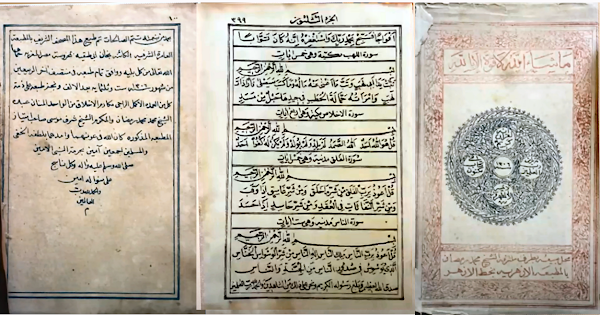
Above are Cairo editions shown during the conference.
In this blog I have shown many more ‒ especially Cairo editions of
riwāya Warš because I find it remarkable that most experts take it for granted that a
muṣḥaf contains Ḥafṣ, basta!
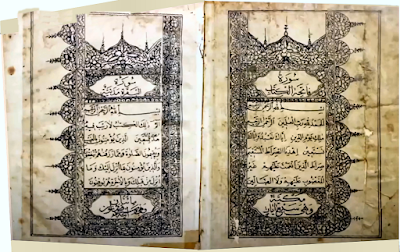
And this is the page at the end of the object of the conference
informing everybody willing to take note
that it was printed in Giza.

And that's not all.
Not only that it is NOT a Cairo print,
it is not even a 1924 edition.
In 1924 the quranic text was printed,
but after that the backmatter had to be set, made into plates, and printed.
Then the book had to be bound.
By the time it was published, the year was 1925.
Therefore the first edition was embossed:
طبعة الحكومية المصرّية
-- . --
١٣٤٣ هجرّية
سـنة


 The two Arabic texts are the 1924 and 1952 printer's notes, both from the copies in the Prussian State Library, which owns copies from five editions.