The Dominican Institute for Oriental Studies in Cairo calls for papers for two conferences,
one in October, the second in three years.
Strangely the Arabic call is first for a conference on the King Fuʾād Edition (1924) of the qurʾān,
then for one of the "al-Qāhira print,"
the French conference is on « le Coran du Caire »/ «
l'édition du Caire »,
the English one on "The Cairo Edition".
As there are about a thousand editions of the qurʾān published in Cairo,
it just does not make sense to call a
particular edition "
l'édition du Caire".
Of course, once the edition is introduced correctely ‒ as the
King Fuʾād Edition (KFE),
the Egyptian Government Edition of 1924, the Education Ministry Edition (because there later was
a Minsitry of the Interior Edition),
the Amīriyya Edition (of 1924), (or wongly) the Amīrī Edition (taking Fuʾād as the Amīr, instead of
refering to the Government Press/ مطبعة),
the Gizeh print, the Survey of Egypt Gizeh 1924 print [at the time its name was مصلة المسحة ,
now it is الهيئة المصرية العامة للمساحة , hence it is named simply مصحف المسحة ],
the 12-line-edition of the Qurʾān / المصحف ١٢ سظر, the official
Egyptian edition of 1924, the edition prepared by Egypt's
šaiḫ al-maqāriʾ Muḥammad ibn ʿAlī
ibn Ḫalaf
al-Ḥusainī al-Mālikī aṣ-Ṣaʿīdī
al-Ḥaddād (1282/1865‒1357/ 22.1.1939)
‒ one can refer to it as "Cairo edition", or "the 1924 edition",
but not to "The Cairo Edition," nor "al-Qāhira print," nor "Azhar Edition".
The Azhar had almost nothing to do with it.
It was prepared by one man alone; of the four men that signed three are not
ʿulamāʾ, are not expert
qurʾānologists, have never written anything on religious subjects.
Abū Mālik
Ḥifnī Bey ibn Muḥammad ibn Ismaʿīl ibn Ḫalīl
Nāṣif (16.12.1855‒25.2.1919) had been chief inspector of the Arabic department in
the ministery of education. In his youth he had learned the qurʾān by heart, later he became a lawyer,
was part of the modern intelligentzia of the capital.
Aḥmad ibn ʿAlī ibn ʿUmar al-Iskandarī (1292‒1357/1875‒1938) and Muṣṭafā (al-)ʿInānī (d. 1362/ 1943) were teachers at the Pedagocial
Seminary next to the Ministery of Education and have jointely written books on educational matters.
When you make a multilingual conference on "der Erste Weltkrieg," it should be about "la Première Guerre Mondiale" (not about "La Grande Guerre"), one on
the July Revolution 1830 should be on
la Révolution de Juillet 1830 (not
Les Trois Glorieuses), and one on World War II, should be on вторая мировая война (not on Великая Отечественная Война).
But in the English call for papers 16 times "the Cairo edition" is used, a term for which no Arabic
equivalent exists. (( When you google the Arabic term that come first to your mind "muṣḥaf al-Qāhira" you get hits, but nothing near the KFE.)) Hence in the Arabic call first ten times "the King Fuʾād
muṣḥaf" is used and then
six times the "Qāhira print", although al-Qāhira is the Old City founded by the Fatimides, where most
private printers reside (have their
siège social) and most had their workshop too, Būlāq lying outside, Gizeh, where the King Fuʾād Edition WAS printed even on the other side of the Nile: in an other Gouvernement
/muḥāfaẓa.
Twice "the Cairo edition" has as accidental qualification "of 1924", which is not good enough ‒
"the 1924 Cairo edition" with "1924" as necessary attribute, as defining property would be acceptable, but the Dominicans never use that term, nor "the 1924 Egyptian Government edition," nor "the edition of the Ministry of Education"(the Ministery of Interior had later
maṣāḥif printed as well), nor "the edition prepared by the
Šaiḫ al-maqāriʿ al-maṣrīya."
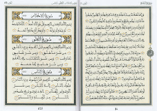
Strangely the Domanican Institute manipulates the image of the title box of the Fatīḥa:
Only the top and right side are okay, the bottom and left side (below in lighter yellow) are mirrored by software,
and more important: the text in the middle is NOT from the 1924 Gizeh print!
The original is not self centred, but stands in relation with the title box of al-baqara on the opposite page.


 The press wasn't in the Sherifian Kingdom, but in Cairo. Al-Muǧallad al-ʿArabi (often printers make up names for special occasions) was in charge.But the third edition was home made ‒ in a press founded in Faḍāla (named Muhammedia since 1959) after WWII and bought in the 1960ies by the Minstery for Religious Affairs and Pious Foundations al-Maṭbaʿ al-Faḍāla.

 While under Hassan II there was only one Royal Muṣḥaf (in cheap and in expensive editions) ‒ written by seven Moroccan calligraphers
 there are new four different ones:
‒ one hand written, similar to his father's
there are new four different ones:
‒ one hand written, similar to his father's ‒ one computer set ‒ "andalusian", i.e. with green dots for hamzat,