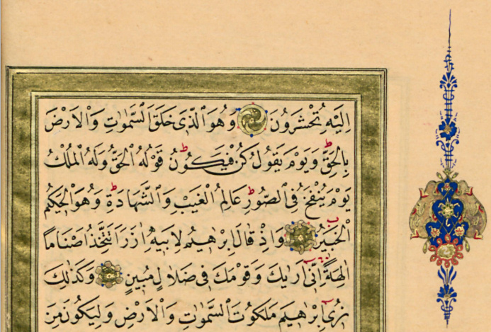
Orientals have a well-established narration about the collection of the qurʾān
and its subsequent dissemination to the central cities of the empire.
Orientalists ‒ keener in scrutinizing real old manuscripts ‒ had the best time ever:
first came the quranic manuscripts from the Great Mosque of San'a'
then came the realisation that a couple of fragments belong together:
that they had been one codex in the ʿAmr ibn al-ʿĀṣ mosque in Fustat before being dispersed.
And after studying the famous palimpsest and the fragments in London, Paris, Petersburg
Orientalists came away "assuming/knowing" what Muslims had "believed/known" for a long time:
during the caliphate of ʿUṯmān the text has been standardised.
So far, so good.
But the Orientalists made another discovery:
The early manuscripts were not written in the spelling known as "al-rasm al-ʿUṯmānī",
but in what Michael Marx calls "Hijāzī spelling" ‒ implicitly calling the common "rasm al-ʿUṯmānī" "Kūfī spelling"
‒ although one finds some "Hijāzī spelling" ( علا for على
;
حتا for حتى ) in Kūfī mss.
In order not to burry the ʿUṭmānic rasm Behnam Sadeghi comes up with a new concept:
the morphemo-skeletal text: nevermind the concrete rasm,
as long as it is the same morpheme (David, thing, about, until) it is the same text.
I have no problem with that,
but I protest, when someone calls "al-rasm al-ʿUṯmānī" (fixed/discovered/invented about four centuries after ʿUṯmān) al-rasm al-ʿUṯmānī without quotation marks.
You can cling to ad-Dānī's rasm, but please do not call it ʿUṯmānic rasm, because it is not!
"belonging to the ʿUṯmānic text type" is fine:
Persian and Ottoman mss. have the ʿUṯmānic text, but not the "ʿUṯmānic rasm", and the ʿUṯmānic rasm is not known.
Monday, 25 November 2019
Sunday, 17 November 2019
Kūfī verse numbering
It is not wise to repeat hearsay.
But sometimes we do it nevertheless.
Somewhere I had read that in India the Kufī numbering system
has five more verses than the Egyptian Kufī system ‒
without moving any end of verse (therefore both being Kufī),
just by splitting five long verses.
Adrian Alan Brockett wrote that in the 20th century the differences have been reduced
‒ without giving chapter and verse.
But here are four places where India used to differ from Arabia:
4:173, 6:73, 36:34+5 were
4:173+4 , 6:73+4 resp. 36:34
 .
.
 added later:
2:246 and 41:45 can be different in India from Gizeh24 (Brockett p.29)
BHO had both Kufī and Baṣrī, known 100% like "modern" Kufī.
HOQz, MNQ, (HaRi and ar-Rušdi) had exactly the same Kufī numbers as we have today ‒ like Muṣḥaf al-Muḫallalātī and KFE.
al-Muḫallalātī is even one of the four authorities giving in Hyderabad38: At the beginning of seven suras Ottomans have a difference in the Kufi numbering common in Egypt and India:
they count الر (المر in 13) in sura 10-15 and ص in sura 38 as a verse, Egyptians and Indians do not.

But sometimes we do it nevertheless.
Somewhere I had read that in India the Kufī numbering system
has five more verses than the Egyptian Kufī system ‒
without moving any end of verse (therefore both being Kufī),
just by splitting five long verses.
Adrian Alan Brockett wrote that in the 20th century the differences have been reduced
‒ without giving chapter and verse.
But here are four places where India used to differ from Arabia:
4:173, 6:73, 36:34+5 were
4:173+4 , 6:73+4 resp. 36:34

 .
.
In Encyclopedia of Islam II A.T.Welch writes that in India 18:18 was split in two. I can not confirm this. He further writes that Pickthall has this split verse ‒ correct ‒, and that it was only changed in 1976 ‒ it was changed in 1938.BTW, the Ottomans did not have here an additional end of verse:

2:246 and 41:45 can be different in India from Gizeh24 (Brockett p.29)
BHO had both Kufī and Baṣrī, known 100% like "modern" Kufī.
HOQz, MNQ, (HaRi and ar-Rušdi) had exactly the same Kufī numbers as we have today ‒ like Muṣḥaf al-Muḫallalātī and KFE.
al-Muḫallalātī is even one of the four authorities giving in Hyderabad38:

they count الر (المر in 13) in sura 10-15 and ص in sura 38 as a verse, Egyptians and Indians do not.

Thursday, 14 November 2019
Persian / Iran
In one of my first German posts
I show that ʿUṯmān Ṭaha writes less calligraphicly than the 1924 Egyptian government print: UT has a strict base line,
no mīm without white space in the middle = no mīm below lām: the next letter is always to the left. In the UT style
vowel signs are always near "their" letter <--> in traditional Ottoman and Persian style they must
only be in the right order.
All in all, ʿUṯmān Ṭaha is very close to the style of the Amiriyya = a simple Ottoman style.
In a German text I focus on orthography, giving most attention to the Maghrebian-Arab and to the Pakistani-Indian ones
and consequently on the new Arab calligraphic style and the new Pakistani-Indian one. Of course, I display examples from Morocco, from the Sudān, from Russia-Tartaristan as well -- and the earlier Indian style from Lucknow plus example from Punjab, from Bengal and Kerala.
I show many examples from Turkey and the Mašriq, but from Iran, I show mainly Nastaʿliq ones.
Here you see the normal Persian "qur'anic" style, taken from old maṣāḥif, all recently reproduced.

although written by three different (famous) writers, they are similar.
Note in the bottom right, that (like sometimes in India) wa is separated from the word to which it "belongs", something forbidden in Arabic.

Here two more examples of wrong wa- at the end of a line. I find the first example shocking because the silent alif-waṣl is separated from its vowel /a/.
Fist images from four Iranian ʿUṯmān Ṭāhā editions:
 Now an Arab-Persian version which the original ʿUṯmān Ṭāhā writing, but
in 11 lines instead of 15 -- and again twice the grave sin against Arab orthography:
wa- at the end of line:
Now an Arab-Persian version which the original ʿUṯmān Ṭāhā writing, but
in 11 lines instead of 15 -- and again twice the grave sin against Arab orthography:
wa- at the end of line:

Here a more traditional print: 604 pages, a Persan style close to ʿUṯmān Ṭāhā, mostly with the Persian help signs:

All in all, ʿUṯmān Ṭaha is very close to the style of the Amiriyya = a simple Ottoman style.
In a German text I focus on orthography, giving most attention to the Maghrebian-Arab and to the Pakistani-Indian ones
and consequently on the new Arab calligraphic style and the new Pakistani-Indian one. Of course, I display examples from Morocco, from the Sudān, from Russia-Tartaristan as well -- and the earlier Indian style from Lucknow plus example from Punjab, from Bengal and Kerala.
I show many examples from Turkey and the Mašriq, but from Iran, I show mainly Nastaʿliq ones.
Here you see the normal Persian "qur'anic" style, taken from old maṣāḥif, all recently reproduced.

although written by three different (famous) writers, they are similar.
Note in the bottom right, that (like sometimes in India) wa is separated from the word to which it "belongs", something forbidden in Arabic.

Here two more examples of wrong wa- at the end of a line. I find the first example shocking because the silent alif-waṣl is separated from its vowel /a/.
Fist images from four Iranian ʿUṯmān Ṭāhā editions:
Now an Arab-Persian version which the original ʿUṯmān Ṭāhā writing, but
in 11 lines instead of 15 -- and again twice the grave sin against Arab orthography:
wa- at the end of line:

Here a more traditional print: 604 pages, a Persan style close to ʿUṯmān Ṭāhā, mostly with the Persian help signs:

Wednesday, 13 November 2019
never trust a reprint
never trust a reprint ... you did not "improve" yourself!
Köҫök Hafiz Osman = Haǧǧ Ḥāfiẓ ʿUṯmān Ḫalīfa QayišZāde an-Nūrī al-Burdurī (Hac Hattat Kayışzade Hafis Osman Nûri Efendi Burdurlu, d. 4.Ramaḍān 1311/ 11.March 1894) wrote 106 1/2 maṣāḥif.
BülÜk Hafiz Osman (1052/1642‒1110/1698) wrote only 25 (but many En’am-ı Şerif, and hilyeler) One on 815 pages (plus prayer, index, colophon) was often reprinted in Syria ‒ in Egypt mostly as reference in lengthy commentaries.
In Turkey one finds hundreds of different "reprints".
They never give a true picture of the original.

On the left you see a Syrian print (HO the Elder, twelve lines per pages, 815 pages) from before 1950 with many signs that are later missing:
small hā' and yā' for five and ten (fifteen, twenty and so on)
small two letter signs always including bā' giving information about Baṣrī verse numbering
small dotless letters under or above a dotless letter stressing its dotlessnes.
In the middle (HO the Younger) I have highlighted two places:
the first was changed by the modern Turkish editors (see the page on the right), because the letters and signs do not follow right-to-left clearly enough.
the second one (modern edition) show a different rasm ‒
a rasm by the way used by the same calligrapher in the other (the "Syrian") muṣḥaf:

Monday, 4 November 2019
the script
Whereas English is written with
A a B b C c D d E e
F f G g H h I i J j
K k L l M m N n O o
P p Q q R r S s T t
U u V v W x , ; . :
! ? " - 1 2 3 4 5 6
7 8 9 0 ( ) [ ] / \
% & # ' + * ~ ^ { }
(80 chars)
the first qurʾān manuscripts just have
ا ٮ ح د ر و ه ط ك ل
م س ص ع ڡ ڡ ٯ ع ص س
* م ل ك ـه ح ٮ ں ى لا
(30 chars)
Most people know that the earliest manuscripts
do have few diacritical dots, no ḥamza sign, no numerals,
no shadda, no hyphen, colon, just an end of aya sign,
but hardly anybody is aware of two facts:
There is no space between words.
{Th. Bauer is wrong ("Words are set apart by greater spaces" in Peter T. Daniel, ed. p. 559).}
There is no hyphenation: end of line is insignificant.
Start letters and End letters are distinct letters
(although standing for the same sound, they carry a different meaning), whereas Start and Middle forms, End and Iso forms are "just" a consequence of the preceding letter.
As "conservative, liberals, god" are different from "Conservative, Liberals, God"
= A and a are not the same letter
ح and ح are not the same letter
Just as capital letters carry a meaning (person, majesty, name, start of a sentence ‒ in German: noun),
End (resp. Iso) carries the meaning: "end of the word".
 Therefore there was no "space between words" ‒ or was it the other way round?
And because there is no End-waw (and because two alifs NEVER occur WITHIN a word),
after waw at the end of a word an alif was added: the word border runs between the two alifs.
Lakhdar-Ghazal saw a core letter and end markers:
ح ع م
ٮ ل ى
س ص ں
That does not work for all letters and not for all calligraphic styles.
Unicode sees colon, space, Non-Joiner as triggering the end form of ONE letter.
That is clearly wrong for the early manuscripts.
Bauer's "each letter may occur in four different positions: initial, medial, final, and isolated" is a truism, but it shows, that he noticed that the common statement "each letter has four forms/graphic shapes" is untenable, both because many have only one form (in typewriter script), and many have more than twenty (in "high" naskhi). Not trivial: "the common designation of the Arabic script as "consonantal" is incorrect, since the long vowels are represented but consonant gemination is not." (Bauer in Daniel p.561) ‒ although not ALL long vowels are represented (as Bauer knows of course), and some short vowels are represented and diphthongs as well.
‒
Not trivial: "the common designation of the Arabic script as "consonantal" is incorrect, since the long vowels are represented but consonant gemination is not." (Bauer in Daniel p.561) ‒ although not ALL long vowels are represented (as Bauer knows of course), and some short vowels are represented and diphthongs as well.
‒
A a B b C c D d E e
F f G g H h I i J j
K k L l M m N n O o
P p Q q R r S s T t
U u V v W x , ; . :
! ? " - 1 2 3 4 5 6
7 8 9 0 ( ) [ ] / \
% & # ' + * ~ ^ { }
(80 chars)
the first qurʾān manuscripts just have
ا ٮ ح د ر و ه ط ك ل
م س ص ع ڡ ڡ ٯ ع ص س
* م ل ك ـه ح ٮ ں ى لا
(30 chars)
Most people know that the earliest manuscripts
do have few diacritical dots, no ḥamza sign, no numerals,
no shadda, no hyphen, colon, just an end of aya sign,
but hardly anybody is aware of two facts:
There is no space between words.
{Th. Bauer is wrong ("Words are set apart by greater spaces" in Peter T. Daniel, ed. p. 559).}
There is no hyphenation: end of line is insignificant.
Start letters and End letters are distinct letters
(although standing for the same sound, they carry a different meaning), whereas Start and Middle forms, End and Iso forms are "just" a consequence of the preceding letter.
As "conservative, liberals, god" are different from "Conservative, Liberals, God"
= A and a are not the same letter
ح and ح are not the same letter
Just as capital letters carry a meaning (person, majesty, name, start of a sentence ‒ in German: noun),
End (resp. Iso) carries the meaning: "end of the word".

And because there is no End-waw (and because two alifs NEVER occur WITHIN a word),
after waw at the end of a word an alif was added: the word border runs between the two alifs.
Lakhdar-Ghazal saw a core letter and end markers:
ح ع م
ٮ ل ى
س ص ں
That does not work for all letters and not for all calligraphic styles.
Unicode sees colon, space, Non-Joiner as triggering the end form of ONE letter.
That is clearly wrong for the early manuscripts.
Bauer's "each letter may occur in four different positions: initial, medial, final, and isolated" is a truism, but it shows, that he noticed that the common statement "each letter has four forms/graphic shapes" is untenable, both because many have only one form (in typewriter script), and many have more than twenty (in "high" naskhi).

Saturday, 2 November 2019
don't confuse!

Some "see" blue, black and white.
others see strokes and dots,
others Arab words, or words from the beginning of the qurʾān or (among other things) 18 "dagger alifs". I see only nine.
A "dagger alif" is a small alif, an Ersatzalif (supplementary alif)
or a Wandelalif (transforming alif).
The similar looking signs in the "Indian" muṣḥaf from Medina
are no alifs, but fatḥas, standing fatḥas or turned fatḥas,
not letters but vowel signs.
I fail to understand, how anybody can confuse a sign that sits on its letter (or near its ascender)
with a letter that follows a letter+vowelsign-combination.
Once one knows that in the African notation there must be a ḥarf al-madd to lengthen the vowel,
whereas in the Asian notation fatḥa, kasra, ḍamma each have a turned variant for the long vowel,
one SEEs the difference.
Whoever does confuse long vowel sign and Ersatz letter is blind.
In the last line: two Wandelalifs:
there is a ḥarf al-madd, but the wrong one: instead of alif (expected after fatḥa): waw resp. yāʾ here the small alif transforms waw resp. yāʾ into alif. (In the blue line above: (long) standing fatḥa again.)
So not 18 dagger alifs, just seven Ersatzalif plus two Wandelalif.
Not convinced?
Look at these examples.
If you don't see "arguments", study something else (you are not made to study the writing of maṣāḥif).
Here the text from the King Fuad Edition about the small letters (among them "dagger alif"):

And about fatḥa, standing fatḥa, kasra, standing kasra, ḍamma and turned ḍamma.
Friday, 25 October 2019
rasm ‒ consonantal skeleton?
The most common translation for rasm
"consonantal skeleton" is wrong.
Look at the 22nd word of 3:195 واودوا
six letters,
definitely not six consonants.
On the sound level
Arabic, like any language,
has sonants and con-sonants.
But on the sign level,
there are just letters.
It doesn't make sense to talk of Phoenician, Arabic, Semitic consonant letters.
Only once there are sonants/vowels, there can be con-sonants/not sounding on their own.
Since Greeks speak no ḥ, they used the letter ḥēt for ē
Jota for ī, changed ʿain into Omikron, waw into Ypsilon (ū).
When you look into early qurʾān manuscripts,
you will see the letters function as end of word maker &
as long vowels & as diphthongs (ḥurūf al-madd wa'l-līn)
& as short vowels,
not only in the common اولٮك and the less frequent أولوا۠ but in ساورىكم
(7:145, 21:37), لاوصلٮٮكم
(7:124, 20:71, 26:49) and
in rare words like وملاٮه (7:103 + 11:97 + 43:46 ) IPak: وَمَلَائِهٖ / وَمَلَا۠ئِهٖ Q52 : وَمَلَإِيْهِۦ
and اڡاىں (3:144 + 21:34)
IPak: افَائِنۡ / افَا۠ئِنْ Q52: اَفإي۠ن .
Modern readers may perceive two silent letters:
one carrying a hamza,
one otiose.
Originally they stood for ayi or a'i or aʾi --
definitely for short vowels.
Both words are written in IPak with silent alif + yāʾ-hamza
in Q52 with alif-hamza + silent yāʾ.
Add to this alif as akkusativ marker (at the end), as question marker at the beginning, hāʾ (tāʾ marbūṭa) as femining marker
(plus wau as name marker at the end outside the qurʾān عمرو)
and common words like انا.
So, to call all letters "consonants", makes no sense.
To call the rasm "consonantal" is wrong.
Call it: skeleton,
letter skeleton,
basic letters,
skeletal text,
stroke,
drawing.
Unfortunately most academics repeat what their predecessors wrote,
they can't look for them*selves, don't mention thinking for them*selves --
whether female, male, trans*gender or non*binary.
Monday, 21 October 2019
Kein Standard Two (How did they make Gizeh 1924?)
Angelika Neuwirth, an expert on the genesis of the Qur’an before 623,
knows nothing about the history of printed maṣāḥif,
but she writes about it:
Does she ignore that the Qur’an was printed in 1537, in 1694, in 1698, in 1787 for the first time by Muslims in St. Petersburg, in 1834 in Leipzig, in the 1830s ten different prints in Persia and India?
Does she ignore that from 1875 each year thousands were printed in Istanbul and India?
What does she mean by "end up in the form of a printed text"?
What does she want to say by "transmitted generation by generation"?
Okay, before sound could be recorded, the oral text had to be taught from teacher to pupil:
it was indeed transmitted through the ages.
But was that necessary for the muṣḥaf?
Was it not possible to read (and copy) a muṣḥaf written by a person dead at the time of reading the manuscript?
It was not common to give an isnād of scribes who each have learned the art of writing a muṣḥaf from an older scribe/ ḫaṭṭāṭ.
When we believe the main editor of the King Fuʾād Edition it was a reconstruction,
based on the oral text and Andalusian books from the 11th and 14th century on the orthography of the qurʾān.
I believe it was an adaptation of a printed copy of the transmission Warš to the normal Egyptian reading of Ḥafṣ.
For sure, it was not the last in a chain of transmitted maṣāḥif, from Egyptian scribe to pupil (through the generations).
Neuwirth has never seen the King Fuad Edition.
Consistently she cites it wrongly.
The book has no title on the cover, no title page; the first page is empty,
the first page with something on it, has the Fatiḥa.
In the afterword, it refers to itself as "al-muṣḥaf aš-šarīf,"
in the dedication to King Fuʾād it calls itself "al-muṣḥaf al-karīm".
Because it has no title, according to the German library rules,
the given/ assumed/ generic title is in brackets: "[qurʾān]",
but Neuwirth gives two different one in the notes:
„Al-Qur‘ân al-Karîm, Kairo 1925“ (Der Koran als Text der Spätantike, p. 30)
and „Qur‘ân karîm 1344/1925“ (Der Koran als Text der Spätantike,. p. 273).
Neuwirth has never read the information/ تعريف at the back of the King Fuʾād Edition,
nor read and understood the article Gotthelf Bergsträßer wrote about it.
Otherwise, she would know that the editors claim to have reconstructed the muṣḥaf from scratch.
The chief editor is not a scribe, but the chief reader/ qāri of Egypt: he knows the qurʾān by heart ‒ in seven to twenty transmissions.
In the تعريف he states that he has transcribed the oral text according to a didactic poem based on two medieval books on the basic letters for writing the qurʾān,
on a Maghrebian book on vowelling but with Eastern vowel signs and other books ...
I interrupt, because I do not believe, what is written in the تعريف
I am convinced that the editor took a Warš muṣḥaf and adopted it to Ḥafṣ.
For the vowelling, he did not have to replace Maghrebian signs by Eastern signs because the system developed by Al-Ḫālil ibn Aḥmad al-Farāhīdī was current in the West because printing colour dots was too complicated/ expensive at the time.
The "information" further informs us that verse numbering and liturgical divisions are according to a recent Egyptian scholar, Abū ʿĪd Riḍwān ibn Muḥammad ibn Sulaimān al-Muḫallalātī, again not informing us that they adopted the Moroccan system in which a ḥizb is half a ǧuz ‒ not a quarter as before, as in Turkey, Persia, India, Nusantara.
There are many more things, in which Egyptian maṣāḥif used to be like Ottoman, Persian, Indian and Indonesian maṣāḥif,
in which from now on they are like Moroccan ones ‒ without giving an authority to whom the King Fuʾād Edition is said to adhere.
—> The KFE just follows Maghrebian maṣāḥif, a switch of tradition, the opposite of what Neuwirth wrote, the opposite of what Bergsträßer believed.
The KFE has three different forms of tanwīn, and three different forms of sukūn ‒ to be precise: the Moroccan sukūn for "unpronounced" (circle or oval) and the Indian sign for "unvowelled" (clearly the first letter of ǧazm without the dot not "ḫa without the dot" as they write).
Egyptian prints used to have signs for long vowels, now they have the Maghrebian system, in which a vowel sign AND a vowel letter (ḥarf al-madd) is needed (hence a small letter is added whenever necessary).
When a word starts with /ʾā/ they used to write the letter hamza (i.e. an alif) + a turned fatḥa,
now they copy the Maghrebian practice:
seatless hamza-sign+fatḥa followed by a lengthening alif.
This does not change the rasm, it is not mentioned in the scholarly literature cited.
Vowelless nūn not followed by h,ḥ,ḫ,ʾ,ʿ,ġ used to have a sukūn (as in Osm, Soltani, IPak), now they have nothing because they are not pronounced (clearly as themselves - not iẓhār) because they are (partly) assimilated or reduced.
compare the beginning of al-Baqara from Bombay vs. Medina (aka IPak vs. Q52):

There used to be two (or three) different madd signs, now there is just one.
In all these things the King Fuʾād Edition clearly copies Maġribi Warṣ muṣāḥif ‒ unlike pauses, numbering, rasm, dotting they are not described in books ON the matter, al-Ḥaddad could only copy them from maṣāḥif. Strangely neither Bergsträßer, nor anyone else noticed that.
And there is more: no more sign for Baṣrī numbers, no more small nūns, when tanwīn before alif is spoken as a/u/i-ni (called "ṣila nūn" or on the subcontinent "quṭnī nūn"/tiny nūn).
To summarize:
Except for the transmission of Ḥafṣ, the Kufī numbering, and a new pause system (based on Saǧāwandī), and the letter font of the Amiriyya (by Muḥammad Ǧʿafar Bey)
this is Maghribian.
That the rasm was not ad-Dānī, not al-Ḫarrāz was clear. When people found out that it was only 95% Ibn Naǧāḥ, the editors in Medina and in Tunis added "mostly" (ġāliban / fĭ l-ġālib) to the information at the end of the book. Since it is 99% Maghribian, I guess al-Ḥaddād just adopted an existing muṣḥaf ‒ the "reconstruction" is a myth.
The other great German qurʾān expert, Hartmut Bobzin, gives the right year, he writes:
before the book could be published it had to be bound.
One can be a good translator of the qurʾān, without knowing a thing about publishing,
but maybe it is not a good idea to write about publishing without knowing a thing about it.
And the King Fuʾād Edition is not the Azhar-Koran, nor known as such.
It was produced by the Government Press under the direction of the Chief Qārī of Egypt, assisted by men from the Education Ministry and the Pedagogical College on Qaṣr al-ʿAinī.
In the end, the chief of al-Azhar and the chief copy editor of the Government Press vouched for correctness.
Only 1977 to 1987, an "Azhar Koran" was printed ‒ in five different sizes, different bindings and get-ups (with two reprints in Qaṭar, the last one in 1988)


Everything Bobzin writes is completly wrong
If there was a wave of prints after 1924 ‒ unsubstantiated by Bobzin ‒ it was to due to offset printing, has nothing to do with the KFE. The only print caused by it, the Kabul print of 1934, is "unknown" by the experts.
In the meantime, young brilliant scholars have surpassed Neuwirth and Bobzin in writing nonsense. Although there are more than a thousand editions printed in Cairo, they call the first (and for over fifty years: the only) Gizeh print "the Cairo Edition (CE)". It is as calling Notre-Dame de Paris "the Paris Novel (PN)."
‒
knows nothing about the history of printed maṣāḥif,
but she writes about it:
the mushaf, i.e. the text put onto sheets, bound between two covers, was transmitted through the centuries, generation by generation ... to end up in the last century, in 1925, in the form of a printed textI fail to understand, what Neuwirth wants to say.
A. Neuwirth, Der Koran als Text der Spätantike, Berlin: Suhrkamp 2010. p. 190
Does she ignore that the Qur’an was printed in 1537, in 1694, in 1698, in 1787 for the first time by Muslims in St. Petersburg, in 1834 in Leipzig, in the 1830s ten different prints in Persia and India?
Does she ignore that from 1875 each year thousands were printed in Istanbul and India?
What does she mean by "end up in the form of a printed text"?
What does she want to say by "transmitted generation by generation"?
Okay, before sound could be recorded, the oral text had to be taught from teacher to pupil:
it was indeed transmitted through the ages.
But was that necessary for the muṣḥaf?
Was it not possible to read (and copy) a muṣḥaf written by a person dead at the time of reading the manuscript?
It was not common to give an isnād of scribes who each have learned the art of writing a muṣḥaf from an older scribe/ ḫaṭṭāṭ.
When we believe the main editor of the King Fuʾād Edition it was a reconstruction,
based on the oral text and Andalusian books from the 11th and 14th century on the orthography of the qurʾān.
I believe it was an adaptation of a printed copy of the transmission Warš to the normal Egyptian reading of Ḥafṣ.
For sure, it was not the last in a chain of transmitted maṣāḥif, from Egyptian scribe to pupil (through the generations).
Neuwirth has never seen the King Fuad Edition.
Consistently she cites it wrongly.
The book has no title on the cover, no title page; the first page is empty,
the first page with something on it, has the Fatiḥa.
In the afterword, it refers to itself as "al-muṣḥaf aš-šarīf,"
in the dedication to King Fuʾād it calls itself "al-muṣḥaf al-karīm".
Because it has no title, according to the German library rules,
the given/ assumed/ generic title is in brackets: "[qurʾān]",
but Neuwirth gives two different one in the notes:
„Al-Qur‘ân al-Karîm, Kairo 1925“ (Der Koran als Text der Spätantike, p. 30)
and „Qur‘ân karîm 1344/1925“ (Der Koran als Text der Spätantike,. p. 273).
Neuwirth has never read the information/ تعريف at the back of the King Fuʾād Edition,
nor read and understood the article Gotthelf Bergsträßer wrote about it.
Otherwise, she would know that the editors claim to have reconstructed the muṣḥaf from scratch.
The chief editor is not a scribe, but the chief reader/ qāri of Egypt: he knows the qurʾān by heart ‒ in seven to twenty transmissions.
In the تعريف he states that he has transcribed the oral text according to a didactic poem based on two medieval books on the basic letters for writing the qurʾān,
on a Maghrebian book on vowelling but with Eastern vowel signs and other books ...
I interrupt, because I do not believe, what is written in the تعريف
I am convinced that the editor took a Warš muṣḥaf and adopted it to Ḥafṣ.
For the vowelling, he did not have to replace Maghrebian signs by Eastern signs because the system developed by Al-Ḫālil ibn Aḥmad al-Farāhīdī was current in the West because printing colour dots was too complicated/ expensive at the time.
The "information" further informs us that verse numbering and liturgical divisions are according to a recent Egyptian scholar, Abū ʿĪd Riḍwān ibn Muḥammad ibn Sulaimān al-Muḫallalātī, again not informing us that they adopted the Moroccan system in which a ḥizb is half a ǧuz ‒ not a quarter as before, as in Turkey, Persia, India, Nusantara.
There are many more things, in which Egyptian maṣāḥif used to be like Ottoman, Persian, Indian and Indonesian maṣāḥif,
in which from now on they are like Moroccan ones ‒ without giving an authority to whom the King Fuʾād Edition is said to adhere.
—> The KFE just follows Maghrebian maṣāḥif, a switch of tradition, the opposite of what Neuwirth wrote, the opposite of what Bergsträßer believed.
The KFE has three different forms of tanwīn, and three different forms of sukūn ‒ to be precise: the Moroccan sukūn for "unpronounced" (circle or oval) and the Indian sign for "unvowelled" (clearly the first letter of ǧazm without the dot not "ḫa without the dot" as they write).
Egyptian prints used to have signs for long vowels, now they have the Maghrebian system, in which a vowel sign AND a vowel letter (ḥarf al-madd) is needed (hence a small letter is added whenever necessary).
When a word starts with /ʾā/ they used to write the letter hamza (i.e. an alif) + a turned fatḥa,
now they copy the Maghrebian practice:
seatless hamza-sign+fatḥa followed by a lengthening alif.
This does not change the rasm, it is not mentioned in the scholarly literature cited.
Vowelless nūn not followed by h,ḥ,ḫ,ʾ,ʿ,ġ used to have a sukūn (as in Osm, Soltani, IPak), now they have nothing because they are not pronounced (clearly as themselves - not iẓhār) because they are (partly) assimilated or reduced.
compare the beginning of al-Baqara from Bombay vs. Medina (aka IPak vs. Q52):
There used to be two (or three) different madd signs, now there is just one.
In all these things the King Fuʾād Edition clearly copies Maġribi Warṣ muṣāḥif ‒ unlike pauses, numbering, rasm, dotting they are not described in books ON the matter, al-Ḥaddad could only copy them from maṣāḥif. Strangely neither Bergsträßer, nor anyone else noticed that.
And there is more: no more sign for Baṣrī numbers, no more small nūns, when tanwīn before alif is spoken as a/u/i-ni (called "ṣila nūn" or on the subcontinent "quṭnī nūn"/tiny nūn).
To summarize:
Except for the transmission of Ḥafṣ, the Kufī numbering, and a new pause system (based on Saǧāwandī), and the letter font of the Amiriyya (by Muḥammad Ǧʿafar Bey)
this is Maghribian.
That the rasm was not ad-Dānī, not al-Ḫarrāz was clear. When people found out that it was only 95% Ibn Naǧāḥ, the editors in Medina and in Tunis added "mostly" (ġāliban / fĭ l-ġālib) to the information at the end of the book. Since it is 99% Maghribian, I guess al-Ḥaddād just adopted an existing muṣḥaf ‒ the "reconstruction" is a myth.
The other great German qurʾān expert, Hartmut Bobzin, gives the right year, he writes:
the publication of the so-called "Azhar Koran" on 10 July 1924 (7.Dhū l-hiǧǧa 1342 in the Islamic calendar)which is not correct either: on that day the printing was finished,
FROM VENICE TO CAIRO: ON THE HISTORY OF ARABIC EDITIONS OF THE KORAN (16th ‒ early 20th century), in Middle Eastern Languages and the Print Revolution A cross-cultural encounter. Westhofen: WVA-Verlag Skulima 2002. p.171
before the book could be published it had to be bound.
One can be a good translator of the qurʾān, without knowing a thing about publishing,
but maybe it is not a good idea to write about publishing without knowing a thing about it.
And the King Fuʾād Edition is not the Azhar-Koran, nor known as such.
It was produced by the Government Press under the direction of the Chief Qārī of Egypt, assisted by men from the Education Ministry and the Pedagogical College on Qaṣr al-ʿAinī.
In the end, the chief of al-Azhar and the chief copy editor of the Government Press vouched for correctness.
Only 1977 to 1987, an "Azhar Koran" was printed ‒ in five different sizes, different bindings and get-ups (with two reprints in Qaṭar, the last one in 1988)


Everything Bobzin writes is completly wrong
Der "Azhar-Koran" löste eine wahre Flut gedruckter Koranausgaben in allen islamischen Ländern aus, da man sich nun für den Korantext auf eine anerkannte Autorität stützen konnte.
The "Azhar Koran" prompted a veritable flood of printed editions of the Koran throughout the Islamic world, as there was now a recognized authority on which the Koran text could be based. ibidem
Die Entscheidung der Kairiner Gelehrten für den Text nach der Lesart "Hafs 'an 'Asim" verschaffte ihr nunmehr gegenüber allen anderen Lesarten einen entscheidenden Vorteil.That Ḥafṣ experienced an upsurge due to the KFE is nonsense. Only in the Sudan it gained a bit ‒ but only because it is closer to the Arabic taught in state schools (which had more pupils now).
there was a pronounced tendency to understand the "Azhar Koran" as virtually a "textus receptus", in other words as the only binding Koran text. The decision by the scholars in Cairo in favour of the text in the "Hafs 'an 'Asim" version secured it a decisive advantage over all other versions. ibidem
Allen "modernen" Koranausgaben bleibt eine Gemeinsamkeit ..., daß für die Herstellung des Satzes keine beweglichen Lettern verwendet werden, sondern stets ein kalligraphisch gestalteter Text zugrunde liegt, der entweder lithographisch oder photomechanisch vervielfältigt wird.Untrue: KFE'24, Kabul'34, Hyderabad'38 and the Muṣḥaf Azhar aš-Šarīf are type set.
all the "modern" editions of the Koran still have one thing in common ... above all in the fact that no movable type is used to set the pages, which are, instead, always based on a
calligraphically designed text which is reproduced either by lithography or by photomechanical processes.
Im Hinblick auf den Text folgte [Flügel] nicht einer einzigen Lesart, sondern bot einen Mischtext (wie das übrigens in den meisten Handschriften der Fall ist).Again, Bobzin states a fact ("most manuscript editions are a mix of readings") without proving it. It would be interesting to get information about one or two, not to mention "most" manuscripts mixing readings!
As regards the text itself he did not adhere to a single reading, but instead provided a mixed text (as was the case in most manuscripts). p.169
In the meantime, young brilliant scholars have surpassed Neuwirth and Bobzin in writing nonsense. Although there are more than a thousand editions printed in Cairo, they call the first (and for over fifty years: the only) Gizeh print "the Cairo Edition (CE)". It is as calling Notre-Dame de Paris "the Paris Novel (PN)."
‒
Thursday, 17 October 2019
Kein Standard
In 1914 a few English- and Scotsmen controlled more than half of the globe
(most of the seas and chunks of land too, including millions of Indians).
Kaiser Wilhelm found that unfair. He started a war.
Five years later Germany had shrunk.
Adolf Hitler found that unfair. He started a war.
As one of the results, German is not understood (less written) by most scholars and scientists anymore.
So today, there are people reading books and blogs that do not understand German.
Therefore, I will repeat in the Lingua Franca of the age, what I have written in German.
In 1834, years after an adequate copy of the Qur'ān was set and printed in St. Petersburg (later in Kazan)
and when lithograph copies began to be produced in India and Persia,
the German orientalist Gustav Flügel came up with a new typeset copy,
with a text of his own ‒ not very different from rasm, ḍabṭ and ḥarakat recognized by Muslims, but different from the canonized variants nevertheless,
and with a numbering system of his Hamburg colleague Abraham Hinckelmann (which diverges from all Muslim systems and places the numbers BEFORE the verse).

Already the cover shows Flügel incompetence: the little hā' above hā' signals "not a tā' marbuṭa", but in this position (above hā' in hudā), hāʾ can not be tāʾ, so it can not carry an ihmal sign:

The alif (before lām mīm) has no madda. raḥmān and ḏālika should have a dagger alif, Flügel's font doesn't have one. How could any scholar use such a print?
 Although it came 50 years too late, it became the standard edition
of European orientalists ‒ for about a century.
Although it came 50 years too late, it became the standard edition
of European orientalists ‒ for about a century.
Later the Egyptian King Fuʾād Edition became the standard ‒ not as I see it ‒ because it was really better than most others, but because it was much better than the orientalist sorry effort, and because most (Central European) orientalists ignored the Maghrebian and Indian prints (Ottoman and Persian prints had a few hundred more alifs as matres lectionis which does not make them inferior, but serves as an argument against them, besides them not indicating assimilation of nūn sākin. ‒ Although most Muslims in Germany use Turkish prints, these are avoided by the scholars.)

This was typeset in 1299/1881/2 in the Egyptian Government Press and printed both in one volume (Princeton library 2273) and in ten and/or thirty leather bound volumes (on the market and "Exhibition Islam," London).
13 years later printed in Bulaq as well:
In 1914 ‒ when the United Kingdom was at war with the Ottoman Empire ‒ Egypt declared its independence, the ruler changed from Wālī/Governor to Sulṭān ‒ Khedive had been the personal title, not a function or an office.
Now it was urgent that Egypt printed its own maṣāḥif. The statement that the "foreign ones" (Istanbul was the capital, not foreign before 1915) had mistakes ‒ without given further information what and where ‒ is propaganda, no real information. Repetition does not turn it into fact.
Kaiser Wilhelm found that unfair. He started a war.
Five years later Germany had shrunk.
Adolf Hitler found that unfair. He started a war.
As one of the results, German is not understood (less written) by most scholars and scientists anymore.
So today, there are people reading books and blogs that do not understand German.
Therefore, I will repeat in the Lingua Franca of the age, what I have written in German.
In 1834, years after an adequate copy of the Qur'ān was set and printed in St. Petersburg (later in Kazan)
and when lithograph copies began to be produced in India and Persia,
the German orientalist Gustav Flügel came up with a new typeset copy,
with a text of his own ‒ not very different from rasm, ḍabṭ and ḥarakat recognized by Muslims, but different from the canonized variants nevertheless,
and with a numbering system of his Hamburg colleague Abraham Hinckelmann (which diverges from all Muslim systems and places the numbers BEFORE the verse).

Already the cover shows Flügel incompetence: the little hā' above hā' signals "not a tā' marbuṭa", but in this position (above hā' in hudā), hāʾ can not be tāʾ, so it can not carry an ihmal sign:

The alif (before lām mīm) has no madda. raḥmān and ḏālika should have a dagger alif, Flügel's font doesn't have one. How could any scholar use such a print?

Later the Egyptian King Fuʾād Edition became the standard ‒ not as I see it ‒ because it was really better than most others, but because it was much better than the orientalist sorry effort, and because most (Central European) orientalists ignored the Maghrebian and Indian prints (Ottoman and Persian prints had a few hundred more alifs as matres lectionis which does not make them inferior, but serves as an argument against them, besides them not indicating assimilation of nūn sākin. ‒ Although most Muslims in Germany use Turkish prints, these are avoided by the scholars.)

This was typeset in 1299/1881/2 in the Egyptian Government Press and printed both in one volume (Princeton library 2273) and in ten and/or thirty leather bound volumes (on the market and "Exhibition Islam," London).
13 years later printed in Bulaq as well:

In 1914 ‒ when the United Kingdom was at war with the Ottoman Empire ‒ Egypt declared its independence, the ruler changed from Wālī/Governor to Sulṭān ‒ Khedive had been the personal title, not a function or an office.
Now it was urgent that Egypt printed its own maṣāḥif. The statement that the "foreign ones" (Istanbul was the capital, not foreign before 1915) had mistakes ‒ without given further information what and where ‒ is propaganda, no real information. Repetition does not turn it into fact.
Wednesday, 16 October 2019
The Shape of the Qur'ān ‒ Guide for Publishers
When I started to write "Kein Standard",
I wanted to show that the King Fuʾād Edition of 1924 is not the standard,
that the maṣāḥif printed by the Tāj Company Ltd. are 100 times more often printed, reprinted in other countries and copied in Pakistan and elsewhere.
The 1924 copy was only reprinted once: 1955 by the Communist government of China ‒
to be precise its text was reproduced, but put into a new frame, with new page headers, with new sura title boxes, new signs on the margin for divisions, saǧadāt and sakatāt.
A title page was added ‒ the original didn't have one.
And two pages were thrown out, because King Fuʾād was mentioned ‒ not republican enough.
In Cairo, it was never reproduced, but somewhat improved ‒ its margin reduced.
1952 the Egyptian Government Press (Amiriyya) produced a "second print,"
different from the 1924 edition at about 900 places.
"That Tāj was more successful commercially is irrelevant.
The King Fuʾād Edition is superior," one might say.
The opposite is true.
Even if we take the ʿUṯmān Ṭāhā edition printed in Medina, which combines 99,8% of the orthography of the 1952 (!) Cairo print with the distribution of the text on 604 pages popular in Istanbul around 1900, with a clear and easy to read calligraphy, it is NOT superior to the Tāj Company Ltd editions, it is just as good ‒ see here.
By the time I had finished the book, something else had caught my eye.
First I discovered, that in Cairo more than ten printers (as well as others in Bairut and Tehran) reproduced the 522-page-muṣḥaf written by Muṣṭafā Naẓīf Qādirġalī
‒ as it was written (in the Ottoman orthography) still in the 1950s,
‒ in the new orthography (with I have called Q24).
So I learned that publishers just change the masora (little signs around the rasm), verse numbers, sura title, divisions (juz, ḥizb ...) ‒ and even the rasm (eliminating a ḥarf al-madd from time to time) without much ado, without informing the public.
Then I noticed that a printer (Aḥmad Šamarlī) had a calligrapher (Muḥ Saʿd al-Haddād) copy the 522-muṣḥaf line by line calligraphically very similar but in the new (African) orthography.
At first, I had believed what the chief editor of the 1924 edition had told G.Bergsträßer, that he had reconstructed the spelling by transcribing the text that he knew by heart according to the Andalusian manuals on the writing of the qurʾān by Abū ʿAmr ʿUṯmān ibn Saʿīd ad-Dānī and his pupil Abū Daʾūd Sulaiman Ibn Naǧāḥ, following Ibn Naǧāḥ, when he disagreed with his teacher.
Later I discovered that the editors of the Medina muṣḥaf written by ʿUṯmān Ṭāhā, wrote that they followed "mostly" Ibn Naǧāḥ, which means ‒ if the 10% of the text that I compared are representative ‒ in 95% of cases.
And that they (i.e. al-Ḥusainī al-Ḥaddad al-Mālikī) sometimes follow neither Abū ʿAmr nor Abū Daʾūd (maybe Abu'l Hasan ʿAlī bin Muḥammad al-Murādi al-Andalusī al-Balansī [d. 546 h] in al-Munṣif or Abū'l Qāsim ibn Firruh ibn Ḫalaf ibn Aḥmad al-Ruʿaynī aš-Šāṭibī (أبو القاسم بن فره بن خلف بن أحمد الرعيني الشاطبي ) [d. 590 h] in al-ʿAqīlat Atrāf al-Qaṣāʾid or in ar-Rāʾiyya الرائية
or as-Suyūtī's [d.849 h] Itqān fī ʿulūm al-Qurʾān 1999
1999
 2019
2019
Then I learnt that some editions follow Mawrid al-Ẓamʾān by al-Kharrāz, which is based on both ad-Dānī and Ibn Naǧāḥ;
and that Gizeh 1924 just follows the most common Moroccan rasm,
the Libyan muṣḥaf al-jamāhīriya follows always ad-Dānī,
and Tāj Company mostly ad-Dānī, because the Indian rasm authority, al-Ārkātī follows ad-Dānī,
that Indonesia had copied several Ottoman and Indian (notably pre-Tāj from Bombay) maṣāḥif, that 1983/4 the government committee (Lajnah Pentashihan Mushaf al-Qurʾan established in 1957) published a standard to bring them together (e.g. introducing an "Indian" sign for /ū/ missing in Turkish and Persian manuscripts), reducing the pause signs to seven, imposing one system of verse numbering (Kūfī with 6236 verses)
that the Committee changed the standard after 19 years ‒ not secretly but in the open AND stating which authority they follow in each case.
September 2018 a list with 186 words to be written differently again was published.
In 171 cases a straight fatḥa will stand, where none was before, but there are 11 cases were it is the other way around.
Three cases concern raʾā = he saw. 1983 it was written as in Bombay and in Bahrije (the two prints reprinted in Indonesia): راٰ In 2002 the scholars changed it to رأى like in Modern Standard Arabic, in 2018 they switched to the African way of writing: رءا
In Tunis there are lots of editions following the transmission of Qālūn, some following the normal Maghrebian rasm, other al-Kharrāz, some in the writing style of ʿUṯmān Ṭāhā, others a "mild" form of Maghribī (not as difficult to read as Fāsī), none copying the Libyan (ad-Dānī) rasm, since that book is readily available.
So I discovered that one must keep the different dimensions apart:
not assuming that there are fixed/necessary links between rasm, reading/transmission, verse counting, names of Sura, liturgical divisions, calligraphic style, page layout (like: each Juz must start on top of a right page, or: verses may not straddle pages {or very rarely} ...)
Yes, the 1924 KFE brought several innovations:
letters are on a baseline, few ligatures, space between words, numbers after each verse (not just an end-of-verse-marker, and signs every fifth verse),
a streamlined system of pause signs;
the reading helps were largely Maghrebian, but a common sign for vowelless and for unpronounced became differentiated.
Strangely most orientalists still assume that the "Cairo/Azhar committee" came up with lots of innovations.
There were some improvements (streamlined Sajawandi pause signs, differentiated sukun signs for vowellessness vs. unpronouncedness), but the main revolution happened with the 1308/1890 al-Muḫallalātī muṣḥaf:
a difficient rasm,
the Maġribi way for writing long vowels:
having always two signs: a vowel sign + ḥarf al-madd
writing if necessary a small (or red) ḥarf al-madd.
Yes, the Iranian Center for Printing and Publication of Qurʾān, came up with a new (simplified) rasm
and at the same time a new (simple) system of vowel signs, pause signs and so on.
One must keep these aspects apart. There are Iranian prints with the new rasm, with the traditional signs, there are prints with the calligraphy of ʿUṯmān Ṭāhā, but with a different rasm from the Medina print.
Most prints published by the Center do not differentiate between iẓhār vs. idġām, of nūn sākin (esp. tanwīn), but some do!
Most Iranian prints do not show assimilation that go further than in MSA, but some do.
The Damascus publisher Dar al-Maʿrifa prints Medinese transmissions (Qālūn, Azraq, Isbahani) with Kufian verse numbers ‒ to make it easier to compare.
Instead of talking of "la version du Maghreb" one should say "the transmission of Warsh", "the verse numbering of Medina II," "the rasm of Ibn Naǧāḥ" or "Q52 rasm aka KFC rasm" (different at two places from Q52) or "the rasm of Muṣḥaf Qaṭar" (different at one place from ʿUṬ/KFC); in other cases of "an elaborated Saǧāwandī pause system with 15 signs" or a "simplified Saǧāwandī pause system with five signs."
True, that is longer, but assuming that these aspects go toghether, is wrong.
Publishers are free to come up with new devices.
Almost 50 years ago the Iranian Center for Printing and Publication of Quran introduced three new signs: small fatḥa, small ḍamma, small kasra where in old Ottoman and Safavid maṣāḥif we find red fatḥa/ḍamma/kasra (just waṣl-sign in Q24).
Ten years later the Center introduced grey for silent letters (later yet, blue or red instead of grey). When it had become cheap and simple to print a second colour they did not go back on their earlier invention: red letters were unpronounced/silent and the fatḥa at the beginning of a word normally starting with hamzatu l-waṣl after a pause, hence spoken as hamzatu l-qaṭʿ stayed small and black.
Yes, there are traditions of qurʾān writing, some aspects normally come together, but not necessarily.
Note:
The publishers do not change the (oral) text of the qurʾān, they just try to make it easier to read or to pronounce it correctly.
that the maṣāḥif printed by the Tāj Company Ltd. are 100 times more often printed, reprinted in other countries and copied in Pakistan and elsewhere.
The 1924 copy was only reprinted once: 1955 by the Communist government of China ‒
to be precise its text was reproduced, but put into a new frame, with new page headers, with new sura title boxes, new signs on the margin for divisions, saǧadāt and sakatāt.
A title page was added ‒ the original didn't have one.
And two pages were thrown out, because King Fuʾād was mentioned ‒ not republican enough.
In Cairo, it was never reproduced, but somewhat improved ‒ its margin reduced.
1952 the Egyptian Government Press (Amiriyya) produced a "second print,"
different from the 1924 edition at about 900 places.
"That Tāj was more successful commercially is irrelevant.
The King Fuʾād Edition is superior," one might say.
The opposite is true.
Even if we take the ʿUṯmān Ṭāhā edition printed in Medina, which combines 99,8% of the orthography of the 1952 (!) Cairo print with the distribution of the text on 604 pages popular in Istanbul around 1900, with a clear and easy to read calligraphy, it is NOT superior to the Tāj Company Ltd editions, it is just as good ‒ see here.
By the time I had finished the book, something else had caught my eye.
First I discovered, that in Cairo more than ten printers (as well as others in Bairut and Tehran) reproduced the 522-page-muṣḥaf written by Muṣṭafā Naẓīf Qādirġalī
‒ as it was written (in the Ottoman orthography) still in the 1950s,
‒ in the new orthography (with I have called Q24).
So I learned that publishers just change the masora (little signs around the rasm), verse numbers, sura title, divisions (juz, ḥizb ...) ‒ and even the rasm (eliminating a ḥarf al-madd from time to time) without much ado, without informing the public.
Then I noticed that a printer (Aḥmad Šamarlī) had a calligrapher (Muḥ Saʿd al-Haddād) copy the 522-muṣḥaf line by line calligraphically very similar but in the new (African) orthography.
At first, I had believed what the chief editor of the 1924 edition had told G.Bergsträßer, that he had reconstructed the spelling by transcribing the text that he knew by heart according to the Andalusian manuals on the writing of the qurʾān by Abū ʿAmr ʿUṯmān ibn Saʿīd ad-Dānī and his pupil Abū Daʾūd Sulaiman Ibn Naǧāḥ, following Ibn Naǧāḥ, when he disagreed with his teacher.
Later I discovered that the editors of the Medina muṣḥaf written by ʿUṯmān Ṭāhā, wrote that they followed "mostly" Ibn Naǧāḥ, which means ‒ if the 10% of the text that I compared are representative ‒ in 95% of cases.
And that they (i.e. al-Ḥusainī al-Ḥaddad al-Mālikī) sometimes follow neither Abū ʿAmr nor Abū Daʾūd (maybe Abu'l Hasan ʿAlī bin Muḥammad al-Murādi al-Andalusī al-Balansī [d. 546 h] in al-Munṣif or Abū'l Qāsim ibn Firruh ibn Ḫalaf ibn Aḥmad al-Ruʿaynī aš-Šāṭibī (أبو القاسم بن فره بن خلف بن أحمد الرعيني الشاطبي ) [d. 590 h] in al-ʿAqīlat Atrāf al-Qaṣāʾid or in ar-Rāʾiyya الرائية
or as-Suyūtī's [d.849 h] Itqān fī ʿulūm al-Qurʾān
 1999
1999 2019
2019Then I learnt that some editions follow Mawrid al-Ẓamʾān by al-Kharrāz, which is based on both ad-Dānī and Ibn Naǧāḥ;
and that Gizeh 1924 just follows the most common Moroccan rasm,
the Libyan muṣḥaf al-jamāhīriya follows always ad-Dānī,
and Tāj Company mostly ad-Dānī, because the Indian rasm authority, al-Ārkātī follows ad-Dānī,
that Indonesia had copied several Ottoman and Indian (notably pre-Tāj from Bombay) maṣāḥif, that 1983/4 the government committee (Lajnah Pentashihan Mushaf al-Qurʾan established in 1957) published a standard to bring them together (e.g. introducing an "Indian" sign for /ū/ missing in Turkish and Persian manuscripts), reducing the pause signs to seven, imposing one system of verse numbering (Kūfī with 6236 verses)
that the Committee changed the standard after 19 years ‒ not secretly but in the open AND stating which authority they follow in each case.
September 2018 a list with 186 words to be written differently again was published.
In 171 cases a straight fatḥa will stand, where none was before, but there are 11 cases were it is the other way around.
Three cases concern raʾā = he saw. 1983 it was written as in Bombay and in Bahrije (the two prints reprinted in Indonesia): راٰ In 2002 the scholars changed it to رأى like in Modern Standard Arabic, in 2018 they switched to the African way of writing: رءا
In Tunis there are lots of editions following the transmission of Qālūn, some following the normal Maghrebian rasm, other al-Kharrāz, some in the writing style of ʿUṯmān Ṭāhā, others a "mild" form of Maghribī (not as difficult to read as Fāsī), none copying the Libyan (ad-Dānī) rasm, since that book is readily available.
So I discovered that one must keep the different dimensions apart:
not assuming that there are fixed/necessary links between rasm, reading/transmission, verse counting, names of Sura, liturgical divisions, calligraphic style, page layout (like: each Juz must start on top of a right page, or: verses may not straddle pages {or very rarely} ...)
Yes, the 1924 KFE brought several innovations:
letters are on a baseline, few ligatures, space between words, numbers after each verse (not just an end-of-verse-marker, and signs every fifth verse),
a streamlined system of pause signs;
the reading helps were largely Maghrebian, but a common sign for vowelless and for unpronounced became differentiated.
Strangely most orientalists still assume that the "Cairo/Azhar committee" came up with lots of innovations.
There were some improvements (streamlined Sajawandi pause signs, differentiated sukun signs for vowellessness vs. unpronouncedness), but the main revolution happened with the 1308/1890 al-Muḫallalātī muṣḥaf:
a difficient rasm,
the Maġribi way for writing long vowels:
having always two signs: a vowel sign + ḥarf al-madd
writing if necessary a small (or red) ḥarf al-madd.
Yes, the Iranian Center for Printing and Publication of Qurʾān, came up with a new (simplified) rasm
and at the same time a new (simple) system of vowel signs, pause signs and so on.
One must keep these aspects apart. There are Iranian prints with the new rasm, with the traditional signs, there are prints with the calligraphy of ʿUṯmān Ṭāhā, but with a different rasm from the Medina print.
Most prints published by the Center do not differentiate between iẓhār vs. idġām, of nūn sākin (esp. tanwīn), but some do!
Most Iranian prints do not show assimilation that go further than in MSA, but some do.
The Damascus publisher Dar al-Maʿrifa prints Medinese transmissions (Qālūn, Azraq, Isbahani) with Kufian verse numbers ‒ to make it easier to compare.
Instead of talking of "la version du Maghreb" one should say "the transmission of Warsh", "the verse numbering of Medina II," "the rasm of Ibn Naǧāḥ" or "Q52 rasm aka KFC rasm" (different at two places from Q52) or "the rasm of Muṣḥaf Qaṭar" (different at one place from ʿUṬ/KFC); in other cases of "an elaborated Saǧāwandī pause system with 15 signs" or a "simplified Saǧāwandī pause system with five signs."
True, that is longer, but assuming that these aspects go toghether, is wrong.
Publishers are free to come up with new devices.
Almost 50 years ago the Iranian Center for Printing and Publication of Quran introduced three new signs: small fatḥa, small ḍamma, small kasra where in old Ottoman and Safavid maṣāḥif we find red fatḥa/ḍamma/kasra (just waṣl-sign in Q24).
Ten years later the Center introduced grey for silent letters (later yet, blue or red instead of grey). When it had become cheap and simple to print a second colour they did not go back on their earlier invention: red letters were unpronounced/silent and the fatḥa at the beginning of a word normally starting with hamzatu l-waṣl after a pause, hence spoken as hamzatu l-qaṭʿ stayed small and black.
Yes, there are traditions of qurʾān writing, some aspects normally come together, but not necessarily.
Note:
The publishers do not change the (oral) text of the qurʾān, they just try to make it easier to read or to pronounce it correctly.
Sunday, 29 September 2019
Quranic Calligraphic Styles
When you leaf through my German Amazon book "Kein Standard", you learn a lot about calligraphic styles,
but I hardly write about them. In my German blog
I show that ʿUṯmān Ṭāhā is less calligraphic than the 1924 Egyptian muṣḥaf: his letters stay close to the baseline, there is no point-meem, the next letter is
always to the left, so ḥarakāt are always near to the letters ‒ and in his first (Syrian) muṣḥaf there is some space between words, in the version he wrote in Medina
often there is no extra space between words.
All in all, ʿUṯmān Ṭahā is very close to the style of the Amiriyya = a simple Ottoman style.
In "Kein Standard" I focus on orthography, giving most attention to the Maghrebian-Arab and to the Pakistani-Indian ones
and consequently on the new Arab calligraphic style and the new Pakistani-Indian one. Of course, I display examples from Morocco, from the Sudān, from Russia-Tartaristan as well ‒ and the earlier Indian style from Lucknow plus example from Punjab, from Bengal and Kerala.
I show many examples from Turkey and the Mašriq, but from Iran, I show mainly Nastaʿliq ones.
Here you see the normal Persian style, taken from old maṣāḥif, but recently reproduced.
although written by three different (famous) writers, they are similar.
Note in the bottom right, that (like sometimes in India) wa is separated from the word to which it "belongs", something forbidden in Arabic.
Here two more examples of wrong wa- at the end of a line. I find the first example shocking because the silent alif-waṣl is separated from its vowel /a/.
In the book I show images from four Iranian ʿUṯmān Ṭāhā editions.
Here an Arab-Persian version which the original ʿUṯmān Ṭāhā writing, but in 11 lines instead of 15 ‒ and again twice the grave sin against Arab orthography: wa- at the end of line:
Here a more traditional print: 604 pages, a Persan style close to ʿUṯmān Ṭāhā, mostly with the Persian help signs:
‒
Sunday, 22 September 2019
Qurʾānic Orthography
Most people think that there is ONE way to write the qurʾān, that if we leave the different qiraʾāt aside and ignore the style of writing, all copies of the qurʾān are the same.
And that they are written alright.
The opposite is true:
there are many different qurʾanic "ortho"graphies and none is ortho/right.
b, k, l, m, n, t ... are fine. Paleo-Linguists argue about ض ص ط ظ
But for modern readers only the vowels are problematic: short and long vowels.
Basically there are two systems:
an Indian system with seven vowel signs (a ā i ī u ū x)
an African System which needs for each long vowel a vowel sign plus the corresponding lengthening letter.
The African system is today common in the Arab world. When there is no lengthening letter (waw, yāʾ, alif) after ḍamma, kasra, fatḥa in the rasm, a small letter is added. When the rules of prosody require an "ī" although no yāʾ is in the rasm, a small yāʾ barī (i.e with the tail to the front) is added.
But when the rules of prosody require a (written/long) yāʾ to be shortened,
that is not reflected in the text.
I am shocked because the lengthening of vowels required by prosody IS shown.
I had no problem with sticking to the base letters, but adding reading helps sometimes defies God's logic.
(Turks and Persians do never show the niceties of quranic assimilation. ‒ That I can understand.)
(Turks note lengthened ī, but not lengthened ū ‒ something corrected in all Indonesian and some Iranian reprints.)
Indians, Turks, Persians, Indonesians are not happy with this. The Arab attitude "everybody knows that these letters do not lengthen the vowel at these places" sounds arrogant in non-Arab hears.
 In XXX:10 /ʾasāʾŭ s-sūʾā/ in India (second line) and Indonesia (last, right) there is no
vowell sign about the wau in /ʾasāʾŭ/, hence it is not pronounced (just as the following alif).
In XXX:10 /ʾasāʾŭ s-sūʾā/ in India (second line) and Indonesia (last, right) there is no
vowell sign about the wau in /ʾasāʾŭ/, hence it is not pronounced (just as the following alif).
In Kerala (first, right) and Turkey (fourth line) that wau is silent because it is only the "seat" of hamza (there would be written "madd" underneath if it were to be pronounced).
In the new Iranian orthography (fifth line, right) all silent letter are pink.
But in the third line (right: Madina: ʿUṯmān Ṭaha; left: Damascus: Dār al-Maʿrifa) there is no Silent-Sign above the wau.
The same in the last line, left (Tunis: Nous-mêmes) ‒ wrong as I see it.
But two of the taǧwīd-Editions based on UT do show the silence of that wau: On the top, left from Bairut (blueish for silence), on the fifth line, left from Damascus (grey triange above for silence).
When shortening doesn't follow a general rule, but applies just to particular places within the text = when a vowel is short because it must rhyme with lines before and after, this IS reflected in the Arab-African text. So why not: all the time?
Here you see words from an Indian manuscript (from Surat Hūd) in which ONLY the vowel SIGNS count, the "lengthening" vowel letters are IGNORED (hence: NO sign above or below) ‒ al-farīqaini in the last line has jazm above the yāʾ because in the diphthong yāʾ is NOT silent.
((Added later: I first had seen just one manuscript from around 1800 with the sign-only orthography, by now I have seen some more ‒ up to the time when lithographs became common, lithographs with the modern/ mixed way of writing long vowel letters)
 on the margin I added doctored versions: signs were moved to a place easier to read for the modern reader
The modern Indian system (black on white background) is a mix of the old consistent system and the African one: when the CORRESPONDING letter follows a vowel sign, the SHORT vowel sign is used (as in Africa), only when there is a different letter or no "lengthening" letter at all, the long vowel sign is used.
In 7:103, 10:75, 11:97 and 43:46 (and 10:83 with an added mīm for plural) pronounciation and rasm are the same; there is only disagreement on whether the alif or the yāʾ is mute:
wa-malaʾihī
IPak: وَمَلَا۠ئِهٖ
Q52: وَمَلَإِي۠هِۦ
In the rasm there are matres (ḥurūf al-madd) for both /a/ and /i/,
‒ indeed here letters (not consonants!) stand for short vowels,
because there was no other way to notice them.
in India alif is silent (the short fatḥa is valid, not the alif), yāʾ carries hamza,
in Arabia alif "carries" hamza below, yāʾ is silent.
In 21:34 ʾa-faʾin
IPak: افَا۠ئِنْ
Q52: اَفإي۠ن
India and osm/Tur make the alif silent
(Indians used to leave the alif without any sign, now they put the silent making circle,
Turks write qaṣr underneath)
for Arabs alif carries hamza, yāʾ is silent.
Muṣṭafā Naẓīf in one of his manuscripts (the 604 pages berkenar one) just drops the otiose letter. اَفَإنْ
It does not help to observe that in his other maṣāḥif he has the superfluous letter. The 604 page muṣḥaf is often reprinted (not as often as the 522 page one, but in different countries) without "correction".
Similar 6:24 min-nabaʾi In Q52 alif "carries" hamza and /i/, yāʾ is silent and in IPak alif is silent, yāʾ carries hamza and /i/.
And that they are written alright.
The opposite is true:
there are many different qurʾanic "ortho"graphies and none is ortho/right.
b, k, l, m, n, t ... are fine. Paleo-Linguists argue about ض ص ط ظ
But for modern readers only the vowels are problematic: short and long vowels.
Basically there are two systems:
an Indian system with seven vowel signs (a ā i ī u ū x)
an African System which needs for each long vowel a vowel sign plus the corresponding lengthening letter.
The African system is today common in the Arab world. When there is no lengthening letter (waw, yāʾ, alif) after ḍamma, kasra, fatḥa in the rasm, a small letter is added. When the rules of prosody require an "ī" although no yāʾ is in the rasm, a small yāʾ barī (i.e with the tail to the front) is added.
But when the rules of prosody require a (written/long) yāʾ to be shortened,
that is not reflected in the text.
I am shocked because the lengthening of vowels required by prosody IS shown.
I had no problem with sticking to the base letters, but adding reading helps sometimes defies God's logic.
(Turks and Persians do never show the niceties of quranic assimilation. ‒ That I can understand.)
(Turks note lengthened ī, but not lengthened ū ‒ something corrected in all Indonesian and some Iranian reprints.)
Indians, Turks, Persians, Indonesians are not happy with this. The Arab attitude "everybody knows that these letters do not lengthen the vowel at these places" sounds arrogant in non-Arab hears.
In Kerala (first, right) and Turkey (fourth line) that wau is silent because it is only the "seat" of hamza (there would be written "madd" underneath if it were to be pronounced).
In the new Iranian orthography (fifth line, right) all silent letter are pink.
But in the third line (right: Madina: ʿUṯmān Ṭaha; left: Damascus: Dār al-Maʿrifa) there is no Silent-Sign above the wau.
The same in the last line, left (Tunis: Nous-mêmes) ‒ wrong as I see it.
But two of the taǧwīd-Editions based on UT do show the silence of that wau: On the top, left from Bairut (blueish for silence), on the fifth line, left from Damascus (grey triange above for silence).
When shortening doesn't follow a general rule, but applies just to particular places within the text = when a vowel is short because it must rhyme with lines before and after, this IS reflected in the Arab-African text. So why not: all the time?
Here you see words from an Indian manuscript (from Surat Hūd) in which ONLY the vowel SIGNS count, the "lengthening" vowel letters are IGNORED (hence: NO sign above or below) ‒ al-farīqaini in the last line has jazm above the yāʾ because in the diphthong yāʾ is NOT silent.
((Added later: I first had seen just one manuscript from around 1800 with the sign-only orthography, by now I have seen some more ‒ up to the time when lithographs became common, lithographs with the modern/ mixed way of writing long vowel letters)

The modern Indian system (black on white background) is a mix of the old consistent system and the African one: when the CORRESPONDING letter follows a vowel sign, the SHORT vowel sign is used (as in Africa), only when there is a different letter or no "lengthening" letter at all, the long vowel sign is used.
In 7:103, 10:75, 11:97 and 43:46 (and 10:83 with an added mīm for plural) pronounciation and rasm are the same; there is only disagreement on whether the alif or the yāʾ is mute:
wa-malaʾihī
IPak: وَمَلَا۠ئِهٖ
Q52: وَمَلَإِي۠هِۦ
In the rasm there are matres (ḥurūf al-madd) for both /a/ and /i/,
‒ indeed here letters (not consonants!) stand for short vowels,
because there was no other way to notice them.
in India alif is silent (the short fatḥa is valid, not the alif), yāʾ carries hamza,
in Arabia alif "carries" hamza below, yāʾ is silent.
In 21:34 ʾa-faʾin
IPak: افَا۠ئِنْ
Q52: اَفإي۠ن
India and osm/Tur make the alif silent
(Indians used to leave the alif without any sign, now they put the silent making circle,
Turks write qaṣr underneath)
for Arabs alif carries hamza, yāʾ is silent.
Muṣṭafā Naẓīf in one of his manuscripts (the 604 pages berkenar one) just drops the otiose letter. اَفَإنْ
It does not help to observe that in his other maṣāḥif he has the superfluous letter. The 604 page muṣḥaf is often reprinted (not as often as the 522 page one, but in different countries) without "correction".
Similar 6:24 min-nabaʾi
Subscribe to:
Posts (Atom)
another UT1 from Damascus
BerKenār ʿUṯmān Ṭaha started in Damascus, but today is mostly associated with Madina. Between 1991 and 2013 when they moved to Bairut, Ṣub...

-
 40 years ago Adrian Alan Brockett submitted his Ph.D. to the University of St.Andrews: Studies in Two Transmissions of the Qurʾān . Now...
 -
 Although it is often written that the King Fuʾād Edition fixed a somehow unclear text, and established the reading of Ḥafṣ according to ʿĀ...
 -
 from a German blog coPilot made this English one Iranian Qur'an Orthography: Editorial Principles and Variants The Iranian مرکز...