The Egyptian Goverment Edition printed in Gizeh in 1924
was the first offset printed mushaf,
It was type set (not type printed).
It used smaller subset of the Amiriyya font not because the Amiriyya laked the
technical possibility for more elaborate ligatures,
((in 1881 when they printed a muṣḥaf for the first time,
they used 900 different sorts, in 1906 they reduced it to about 400,
which they used in the backmatter of the 1924 muṣḥaf,
in the qurʾānic text even less))
but to make the qurʾānic text easier to read for state school educated (wo-)men.
They did not want that the words "climb" at the end of the line for lack of space,
nor that some letter
are above following letters.
It is elegant how the word continues above to the right of the baseline waw,
but it is against the rational mind of the 20th century: everything must be right to left!
The kind of elegance you have with "bi-ḥamdi rabbika" is not valued by modern intelectuals.
Here you see on the right /fī/, on the left /fĭ/, a distinction gone in 1924:
And here you see, with which vowel the alif-waṣl has to be read ‒
something not shown in the KFE.
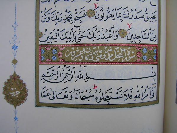
In Morocco they always show with which vowel one has to start (here twice fatḥa), IF one starts although the first letter
is alif-waṣl, the linking alif, with is normaly silent.
In Persia and in Turkey one shows the vowel only after a pause, like here:
Both in the second and third line an alif waṣl comes after "laziM", a necessary pause, so there is a vowel sign between the usual waṣl and the alif ‒ a reading help missing in Gizeh 1924.
Subscribe to:
Post Comments (Atom)
Amīriyya 1978 1398
on the left from the pocket version 1977, on the right the normal one the large Qaṭarī reprint 1988

-
40 years ago Adrian Alan Brockett submitted his Ph.D. to the University of St.Andrews: Studies in Two Transmissions of the Qurʾān . Now...
-
Although it is often written that the King Fuʾād Edition fixed a somehow unclear text, and established the reading of Ḥafṣ according to ʿĀ...
-
from a German blog coPilot made this English one Iranian Qur'an Orthography: Editorial Principles and Variants The Iranian مرکز...


No comments:
Post a Comment